Would you like to escape from your role as the in-house Clarke Kent within your company and stop performing your heroic UX deeds for your organisation anonymously, i.e. without clear evidence? Are you looking to increase acceptance and understanding of UX? If so, read on. UX is often associated with complex questionnaires and user interviews. However, there is a whole array of valuable UX performance indicators that you can use to translate the success and progress of your UX efforts into tangible metrics.
I will cover the seven most important ones in this article. Before describing them in more detail below, I first want to address the following topics:
- What are KPIs?
- What is the difference between KPI and ROI?
- Why should you measure UX KPIs?
- Why is it important to measure the right data?
Ready? Let’s go!
Why should you measure UX KPIs?
Slowly but surely, most companies have arrived in the 21st century and are collecting large amounts of data every day. However, by no means is all data relevant: ‘In ancient times having power meant having access to data. Today having power means knowing what to ignore’, writes Yuval Noah Harari in his book ‘Homo Deus’. Many organisations use metrics such as visitor numbers to assess the success of their website. They think: more visitors → more success → all in the green. But are they really measuring the KPIs that effectively ‘move the needle’ and improve their bottom line? Or are they dealing with ‘vanity metrics’ that feel good but don’t bring about any real benefit?
It’s amazing how many design decisions are still made today without relying on UX-KPI data. For example, your conversion rate might suffer from the fact that the number of form questions on a login page has increased from six to nine. Without continuously measuring the relevant KPIs, you will find it difficult to identify such problems quickly.
What are (UX) KPIs?
KPIs translate the success factors of your project, department or company into numbers, bringing successes and failures to light. The performance indicators are usually different for each project and should always be determined individually. For example, the KPIs relevant to Superman could be:
- Rescued people per hour
- Flight time to arrival at crime scene
- Outfit change time in nanoseconds
For the sales department of a company, the conversion rate (e.g. 10 customer visits → two contract conclusions) is often highly relevant. UX KPIs differ from other KPIs in that they have the difficult task of translating human behaviour, opinions and feelings into numbers. UX aficionados distinguish between behavioural and attitudinal UX KPIs:
| Behavioural UX KPIs (what they do) | Attitudinal UX-KPIs (what they say) |
| Task success rate | System Usability Scale (SUS) |
| Time-on-task | Net Promoter Score (NPS) |
| Search vs navigation | Customer satisfaction (CSAT) |
| User error rate |
At the end of this article, you will find out what these KPIs are all about and how you can measure them in detail.
KPI and ROI – what’s the difference?
Using ROI and KPI, companies can measure how successful they have been in achieving a particular goal. The ROI (return on investment) is a purely financial indicator and quantifies how successful a project was in relation to its investment. For example, if a company invests EUR 10,000 in UX activities to improve its online shop and then generates EUR 25,000 more revenue in the following year, this corresponds to an ROI of 150%. KPIs, on the other hand, are key figures that you can choose or define yourself which translate the success of a project – however it may be defined – into tangible figures. While ROI is only a financial indicator, KPIs are relevant for almost all employees of an organisation – from call centre employees to CEOs – and can be applied to a variety of processes.
Why should you measure UX KPIs?
There are many reasons to start measuring your organisation’s UX KPIs. These are the most important ones:
Stakeholder management
KPIs help you communicate your UX issues and the associated strategic goals more successfully to the relevant decision makers in your company. You no longer need to charm your bosses with vague and qualitative arguments. Instead, you can base your arguments on cold, hard facts and figures. Without these metrics, it is basically impossible to prove before, during or after a project whether your UX team&’s actions have been worthwhile and effective. Reliable data also makes it much easier to put forward arguments when it comes to setting the annual UX budget. Furthermore, if your salary includes a performance-related bonus, you will probably find it much easier to prove your ‘effect’ on the bottom line using KPI metrics.
UX benchmarking
Just like planning a journey, you should first find out exactly where you are located before attempting to navigate to a destination. Only then can you move step by step in the right direction, regardless of how far away you are from the destination. With your UX KPIs, you always have a powerful business navigation tool at your fingertips that protects you from making a wrong turn and wasting valuable time (and money). UX data also allows you to benchmark your project against internal or external reference data sources (e.g. competitors, if data is available) and find out where you still have homework left to do.
Early warning system
UX KPIs drastically reduce the complexity of large amounts of data and give you fast and accurate information about the ‘health status’ of your product. In their combined form, UX KPIs act like pulse, temperature and blood pressure for a physician, who can use this vital data to quickly determine for the entire organism whether something is wrong and might require intervention.
What should be measured?
Key to the success of your UX activities is measuring the KPIs that are truly relevant. Figuratively speaking, measuring a patient’s hip circumference to heal a sprained arm is of little use. It’s best to start by focusing on measuring the two or three most important UX KPIs for your organisation or project. This will help you stay on top of things and avoid unnecessary confusion at the outset. Different goals and projects require specific UX KPIs that need to be measured. Here are two practical examples: Increasing website registrations
- Time-on-task (of the login flow)
- User error rate
More sales
- Task success rate
- Number of clicks per purchase
The seven most important UX KPIs
UX KPIs are divided into behavioural and attitudinal KPIs:
Behavioural UX KPIs (what they do)
Behavioural KPIs express in numbers what a user is effectively doing and how they interact with a product or website. Nowadays, this data can usually be collected fully automatically without the intervention of an interviewer or observer. This is therefore a fairly simple and inexpensive way to start collecting UX KPIs.
1.1. Task success rate
The task success rate (TSR) measures the number of correctly executed tasks and is used very frequently. If a task has a clearly defined endpoint &– for example, filling out a form or buying a product – you can measure the TSR. However, you need to be clear about what goals you consider a success in a particular case before you start collecting data.
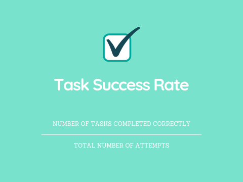
Although the TSR does not say anything about why a user is not successfully completing a task, it is an initial, very valuable indicator. Example: Ten respondents are given the task of ordering 10 red, 10 yellow and 10 white roses using express delivery and credit card payment in a flower delivery company’s online shop. Eight of the testers manage to complete the task successfully. Two testers do not succeed:
- User 1 has problems with credit card payment
- User 2 cannot locate the yellow roses on the website
In this case, the task success rate is calculated as follows: 8/10 = 0.8 x 100 = 80% Expert tip: You should also measure the TSR of users who are performing a task for the first time. This allows you to check if or how this metric changes when the user has more experience with the service or product. Basically, the higher the success rate, the better the user experience.
2. Time-on-task
This KPI describes the time (in minutes and seconds) that a user needs to complete a task successfully. The average time-on-task is usually communicated as the final UX KPI. Basically, the shorter the processing time, the better the user experience. Example: Seven respondents are given the task of locating the customer service telephone number on a website. These are the times it takes them to do this:
| User no. | 1 | 2 | 3 | 4 | 5 | 6 | 7 |
| Seconds | 22 | 15 | 60 | 24 | 18 | 31 | 17 |
In this case, the time-on-task is calculated as follows: (22+15+60+24+18+31+17)/7= 26.71 seconds
3. Search vs navigation
Navigation bars represent an important instrument within the website’s ‘orchestra’: if a user does not manage to reach their destination via the navigation, then the search function is usually the next logical step. In many cases, the less the search function is used, the better the customer experience. It is always advisable, however, to decide on a case-by-case basis which of the two metrics is more desirable. Let’s take the example of a website with only 10 subpages, which typically would have no search function and does not need one due to its clarity.
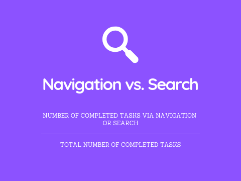
Example: You give nine testers the task of ordering three sunflowers in a florist’s online shop. Then you analyse how many users use the navigation and search fields.
123456789#%
| User no. | |||||||||||
| Search | X | X | X | 3 | 33 | ||||||
| Navigation | X | X | X | X | X | X | 6 | 66 |
Calculation of the search/navigation ratio: Search 3/9 = 0.33 x 100 = 33% Navigation 6/9 = 0.66 x 100 = 66%
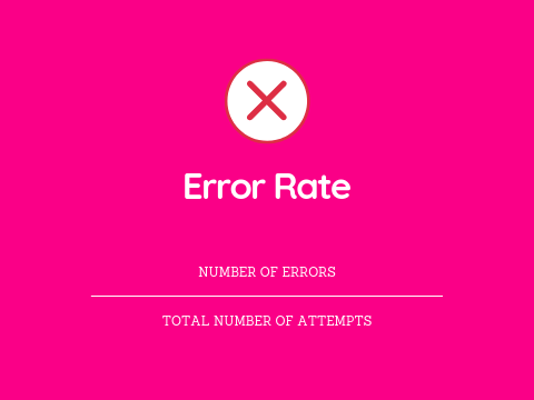
4. User error rate
The user error rate (UER) is the number of times a user makes a wrong entry. Let’s take the example of the usually unsuccessful attempt to enter the user’s date of birth in the address field. The UER gives you an idea of how clear and user-friendly your website is. The higher the UER score, the higher the number of usability problems. Again, it is important to define in advance which actions represent an error. The user error rate can be calculated in different ways. Here are the two most common types of measurement: Error occurrence rate: If a task only allows one potential error (or there are several and you only want to measure one of them), this is the metric to use.
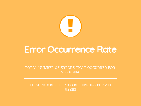
Example: Five out of 100 users enter their e-mail address incorrectly in the ‘Repeat e-mail address’ field. The error occurrence rate is calculated like this: 5/100 = 0.05 x 100 = 5% Error rate: If multiple errors are possible per task (or you want to measure multiple errors), you can do this using the error rate.
Example: Six testers have the task of making an international bank transfer in a bank’s online portal. The task entails five possible errors and the user error rate is distributed as follows:
| User no. | 1 | 2 | 3 | 4 | 5 | 6 |
| Number of errors | 3 | 1 | 2 | 3 | 2 | 1 |
The error rate is calculated as follows: (3+1+2+3+2+1)/6×5= 0.4 x 100 = 40%
Attitudinal UX KPIs (what they say)
This type of UX KPI measures how users feel or what they say before, during or after purchasing a product. In this section, I will introduce three prominent examples of this type:
5. System Usability Scale (SUS)
According to its inventor John Brooke, the System Usability Scale (SUS) is a ‘quick and dirty’ tool with which you can test the usability of a product. The scale consists of a 10-point questionnaire with five possible answers each, ranging from strongly agree to strongly disagree.
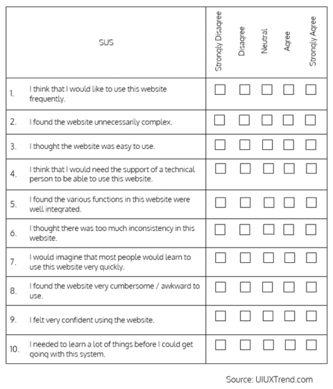
Example: You want to measure the usability values of your website. Using the questionnaire results, you can calculate the ‘SUS’ score (0 to 100), which averages 68. Therefore, if your website scores below 68, it will typically have serious flaws and will need to be optimised.
6. Net Promoter Score (NPS)
The Net Promoter Score illustrates customer satisfaction – and loyalty – in one simple metric. Several studies have also confirmed that the NPS is statistically relevant and correlates with a company’s growth. The user is asked only one central question to determine the NPS: How likely is it that you will recommend (brand, website, service, etc.) to a friend or colleague? The user answers this question on a scale of one (very unlikely) to 10 (very likely). 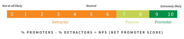 The answers are then grouped into three categories, with the ‘passives’ not taken into account in the calculation:
- Detractors: 0 to 6
- Passives: 7 to 8
- Promoters: 9 to 10
Net Promoter Score: (Number of promoters – number of detractors) ÷ (number of respondents) x 100 Example: A survey with 50 participants returns the following results:
| Category | Number |
| Detractors (0-6) | 10 |
| Passives (7-8) | 10 |
| Promoters (8-10) | 30 |

This is how the Net Promoter Score is calculated: (30 – 10) ÷ 50 = 0.4 x 100 = 40% Further information about NPS and its calculation can be found here.
7. Customer satisfaction (CSAT)
The CSAT is another attitudinal UX KPI that expresses customer satisfaction in a convenient metric. Users/testers are asked: How satisfied are you with (website, product, service, etc.)? The result is a percentage from 0 to 100, where 100 stands for maximum customer satisfaction. The scale usually includes five rating options, ranging from very dissatisfied to very satisfied. 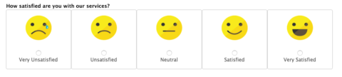 Since the CSAT score can be determined quickly and easily, it is also possible to measure it at several points of interaction with a customer (such as in the TOFU, MOFU and BOFU phases). With this method, it is possible to determine at which point in the funnel the customer might still be stuck. Customer satisfaction: (Number of satisfied customers) / Number of respondents x 100 = % of satisfied customers The survey results are then classified and evaluated as follows:
- Very dissatisfied
- Dissatisfied
- Neutral
- Satisfied
- Very satisfied
To calculate the CSAT score, only the answers of the satisfied users are counted, i.e. the users who gave ‘satisfied’ or ‘very satisfied’ as an answer. Example: After a successful purchase, ten customers are asked how satisfied they are with the usability of your website and give the following answers:
12345678910
| User no. | ||||||||||
| Answer | 2 | 4 | 5 | 3 | 5 | 1 | 4 | 2 | 1 | 5 |
| Satisfied customers | X | X | X | X | X |
The CSAT score is calculated as follows: (5 / 10) = 0.5 x 100 = 50% Further information on the customer satisfaction score can be found here.
Summary
Using the UX KPIs presented in this article, you already have very powerful tools at your fingertips. Finally, you can translate the value of UX into the language of your colleagues and superiors. It’s time for UX to have the status it deserves in your organisation. And the sooner you start measuring, the sooner you can slip into your Superman outfit.
Have you already defined UX KPIs for your organisation? If so, what metrics do you use and why? What has changed (positively) since you started measuring? How has your influence in the company developed since then? If not, what is stopping you from measuring? What would have to happen for you to start measuring?