Interaction designers need to make UX measurable. We can measure the quality of apps and websites using NPS scores, analytics and conversion rates. This blog post isn’t about getting feedback as such. It’s about building user experiences with data as a raw material.
Table of contents
- Sketch/wireframe/prototype
The established approach to UX design has its limitations. - Designing a search box
The search box design is based on the underlying data of a website. - Banking dashboards
Bank balances are headline data with different states. - Offering data as micro-visualisations
Simplify the data on offer. - The future: beyond the user interface
Adapt your data to new media and devices.
Sketch/wireframe/prototype
Here’s a simplified UX approach for websites, apps and online services. I’m going to call it Wireframe UX.
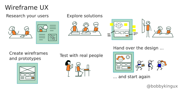
- Research your users – work out who they are, what they need and how they will use the product.
- Explore solutions and refine these with a project team.
- Create wireframes from your rough sketches.
- Create a prototype which customers can interact with.
- Test with real people and change the design if necessary.
- Hand over the design to developers to build it.
The design evolves from low to high fidelity. Designers create wireframes to help the team see things from the end user’s point of view. The limitation of this approach is that we can end up thinking mainly in terms of two-dimensional pictures, even when interactivity is involved.
I feel it’s time to start looking beyond wireframes and start designing with data. I’m not calling for an analysis of the data: good designers are doing that already. I’m saying we need to work with data in the same way we work with fonts, colours, HTML, CSS and responsive views. It’s a raw material. It’s the third dimension of the web.
Designing a Search box
To begin with, let’s take a look at an established design pattern:
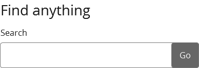
A search box is made up of:
- a label
- an input field with a placeholder
- a call to action button
- filters
The complexity comes from the content: what is the search box going to search?
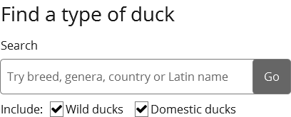
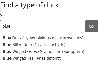
For example, suppose you design a search box for a website all about ducks. How many items will the search engine go through? I had a quick look on Wikipedia:
- Domestic ducks: 100 breeds.
- Wild ducks: Aythyinae (15 members) and Anatinae (seven ‘genera’ and around 20 other types).
So if you were approaching the user experience as an information architect you’d decide how to categorise the ducks – a ‘taxonomy.’ You would then decide how to help site visitors to find the breed they’re looking for. You might allow them to filter by type or the country where they live:
You may use predictive search – after you type three characters in the search box the website starts suggesting results.
If the search box is going to trigger a search through billions of web pages, photographs or videos rather than a few hundred ducks, you may need to tailor the design; you may also want to offer an advanced search page.
The point is this: to design a search box you have to start with the underlying data you have and choose the best design pattern to deliver it. Otherwise, all you have is a rectangle with a label.
Banking dashboards
Let’s look at the way banking dashboards offer up underlying data. They usually use cards to display multiple bank accounts on one screen:
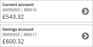
In these examples there are actually three kinds of data on each card:
- ‘Current account / Savings account’ – a hard-coded description of the type of account
- ‘Account number’ and ‘sort code’ – the unique ID for each account.
- The bank account balance – this is the headline data. It’s the thing which the customer actually logs in to see.
The account balance is the only piece of data which is variable. A bank account often has three states, it is in:
- credit
- an authorised overdraft
- an unauthorised overdraft
So, as a designer you need to communicate the states, using a combination of words, symbols and colours:

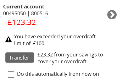
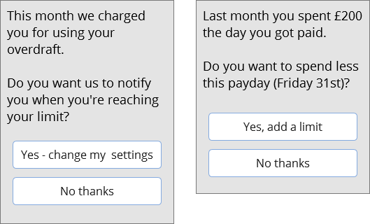
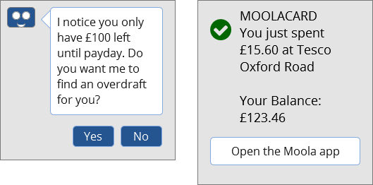
That’s the basic idea. But rather than just indicating the state, you may add a prompt: perhaps a stern message about the overdraft:
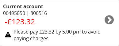
A more helpful message would be to tell the customer what they need to do to avoid charges:
You can go even further. By using the interaction state of ‘unauthorised overdraft’ you can offer more complex prompts which automate their banking activity:
At this point, we’ve gone beyond using states to triggering prompts. As apps and devices become more sophisticated we have more digital media to interact with. Designers need to think of new ways of offering the underlying data.
Offering data as micro-visualisations
Bank balances exist in a state of constant change, like the value of Pounds Sterling. Forward-looking banks like Monzo have started to help their customers manage their finances by offering a kind of customisation: a ‘Safe to spend’ amount:
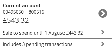
If a customer enters their monthly payday into the app the app can work out how much she can spend without getting overdrawn. To get the correct figure it deducts her direct debits/cheques/standing orders and pending transactions from her current account balance.
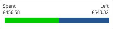
If you’re designing with data, you can offer micro-interactions to sum up her spending without her leaving the dashboard.
To start with, use a bar to show how much is left in this calendar month:
Offer quick summaries of her spending over a month:
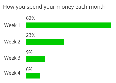
When a customer interacts with an organisation over time they leave a trail. If the information is useful to them, such as a month’s spending transactions, try offering them a useful summary:
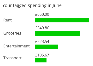
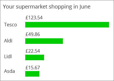
Let them drill down to specifics:
Micro-visualisations only work for users who can see and understand a screen. Designers need to include people with poor eyesight and dyslexia. There are also a lot of contexts where the user will start using their voice to get a bank balance. Soon you will be able to get your bank balance from a smart car connected to your bank account.
So as a designer, consider how to summarise the underlying data, and how to tailor it to different mediums and the needs of users.
The future: beyond the user interface
Finally, let’s look at ways that we can offer data without using a web page or app.
In our interconnected and information-overloaded world, our user has to be able to customise his prompts. He chooses how often he gets updates and the media he’ll get them in.
He can also choose settings which might influence his own behaviour, including spending money.
Some FinTechs are offering bot helpers to help you control your spending while others offer instant feedback on your smartphone when you make a physical card payment.
The connected bank card is an example of the ‘Internet of things.’ This may soon include your car, your central heating, or wearable technology which can monitor your heart rate or body temperature. Users won’t just be interacting with a single website or app.
There will be even more need for talented designers. The underlying data for a banking transaction is likely to stay the same – a customer has money or he owes money. He makes deposits and payments and has a balance which he needs to keep track of. Our challenge is still to make the experience as straightforward and delightful as possible. My advice is: start with the data and adapt it to the medium to create a good user experience.