
Table of contents
From qualitative work via UX metrics to ROI
- Before measurement: planning
- Always start thinking from the end-result
- What is the purpose of your metrics?
- SEQ – Single Ease Question
- SUS – System Usability Scale
- SUPR-Q – Standardized User Experience Percentile Rank Questionnaire
- NASA-TLX – Task Load Index
- NPS – Net Promoter Score
- CES – Customer Effort Score
- Do not forget: the follow-up question
- TCR – Task Completion Rate
- TCT – Task Completion Time
- CR – Conversion Rate
- AOV – Average Order Value
- Classic web analytics (bounce rate, pages per visit…)
- Technical metrics (load time, Google Lighthouse, WCAG Score…)
Tips for introducing metrics to the team
Introduction
User experience costs money. We cost money ourselves, as we do not work for free. Our workplace costs money. And the test subjects who take part in our research activities cost money. Even if they do not get paid because they are employed in our company – at any rate they cannot make any money while they are taking our user test.
As a UX expert, you obviously know that this money is superbly well invested. A better UX leads to more satisfied employees, fewer mistakes, reduced support requirements and, ultimately, more revenue. But you first have to make that clear to some of your colleagues and, above all, to your managers. A few figures or metrics can help in this respect.
In this guide, I’ll give you some valuable tips on how to pick the right metrics, apply them correctly, and present the results in a meaningful way. In this way, you will demonstrate the value of your work, document your successes and better judge the progress of your UX-related efforts for yourself, helping your further development.
The good news is that even if many UXers do not have much experience with metrics and statistics, the learning curve is not steep and you can easily start working with metrics without much effort.
Continue reading online or download the eBook as a PDF:
From qualitative work via UX metrics to ROI
Qualitative work is always at the heart of your work as a UX expert. You want to know why people do something and what exactly they do – how many of them there are is not so important at first. And that is how it should be. Nevertheless, it can also be helpful for you if you include a few metrics that take quantitative approaches in your methodological toolbox. In most cases, this means hardly any extra work for you, because the metrics generate themselves, so to speak.
In this connection, you can distinguish between two types of metrics:
- Metrics that you just need to record, such as the task completion rate/success rate (could the test subject complete the task?) or the task completion time (the time that the test subject needed to complete the task).
- Metrics that you have to collect yourself and that reflect subjective satisfaction (you usually do that with a simple questionnaire).
Before measurement: planning
But before you start, first plan what it is you want to find out. Don’t just jump in and start measuring. Instead, first ask: why do I want to measure in the first place? What is the point of these results?
One can measure everything; however, our goal is not to accumulate more data than anyone can deal with; rather, it is to generate valuable information as a possible basis for decisions.
Imagine that a colleague comes with the request to measure the number of pages accessed per visit on your website. The best thing to do is to ask them (or ask yourself) why they want to measure this. They probably want to know if the content of your site is appealing to the visitors. Why does your colleague want to know this? Because only in this way can you convince the visitor that you have a good product. So you can then also ask: how do you know whether the visitor is convinced? If they submit an enquiry or callback request, or similar. Now you have arrived at the really interesting metric: the number of enquiries relative to the number of pages visited.
As you would do with a usability test, you therefore draw up a hypothesis. In our example, this would be expressed as follows: the more pages a visitor accesses on our website, the more we can convince them to get in contact with us.
So in future, your best course of action is to measure these two values together: the number of pages accessed by a visitor and whether they made an enquiry. This way, you get valuable information: if, for example, the number of visited pages is increasing rapidly but the number of enquiries is not, this may indicate that visitors are not finding what they are looking for. Or that they no longer find the pages convincing. And one thing stands out as a result: the qualitative aspects are still crucial – without them you cannot interpret numbers meaningfully.
Always start thinking from the end-result
When planning your measurements, always think about the results that interest you rather than the metrics that some tool provides.
The following is the best way to proceed:
- Define your objective. What do you want to achieve with the user? For example, perhaps you want them to leave their contact details on the website and, ultimately, become a customer.
- Define the behaviour. What user behaviour shows you that you have achieved your goal? They might, for example, download a white paper or arrange a consultation.
- Define the metric. How can you measure this behaviour? In our example, you could capture the submission of the contact form.
If you identify several possible metrics using this method, select one of them. Collecting data is not difficult, thanks to modern tools. Interpreting it, on the other hand, is still laborious. This is where your expertise is called for.
Also think about the areas for which you want to collect the respective metrics: for the whole company or corporate brand? For a specific product? Or just for a single task that the user takes care of with the product?
As the manufacturer of mobile devices, you could measure user satisfaction with your company. You could also find out how satisfied customers are with a special smartphone. Or you could collect information on user satisfaction with the camera on this smartphone. These are all meaningful and interesting metrics – but you do not have to measure all three always and everywhere.
What is the purpose of your metrics?
In the next planning stage, you need to think about who will look at your metrics later. So, for once, it is not about the users of the product but the users of your metrics. So you’re doing a sort of target audience analysis for the users of the metrics you want to collect in the future.
You can generally distinguish between two basic user types here:
- Business users (managers, controllers, product managers, the marketing team…)
- User experience experts
With User Group 1, the main business metrics are return on investment (ROI), i.e. how much money my measure is bringing, as well as the classic analytics values (bounce rate, conversion rate, pages per visit…).
User Group 2 typically has an interest in user-centric metrics such as NPS, SUS, error rate, task completion time (in this case, user behaviour is the focus of attention). We will look at these metrics more closely in a moment.
Select the right metrics
Which metrics are the right ones? There are a huge number of different metrics, so here are some tips on choosing the best ones for your specific case. Because the difference between the individual metrics is not that big. There is a strong correlation between virtually all of them. This means that the results are quite similar, whatever metric you use. But more on that later.
The first rule is always: do not create your own metric. Rather, use one that already exists. There are two reasons for this:
- If you use a commonly used metric, you can compare your results with others.
- Developing metrics requires a lot of expertise.
Especially if you want to find out about the attitudes, opinions and experiences of users, there are a few points to watch out for. Even if you first think, ‘It costs nothing to ask’, it is not so easy to get meaningful answers. Because lurking behind every question is the danger of getting a false answer.
How exactly you frame the question plays a significant role. It is also important to consider when you ask the respective question. Moreover, the possible answers influence the answer you get. Finally, the context determines which answers are given; this includes the questions that you ask before or after a question.
A very simple example follows to illustrate this. You ask test subjects two questions:
- How would you rate your overall happiness on a scale of 1 (very happy) to 7 (very unhappy)?
- Overall, how would you rate your happiness with your career on a scale of 1 (very happy) to 7 (very unhappy)?
The two questions have an influence on each other: someone who rates themselves as happier overall will tend to rate themselves as happier in their career, too.
But if you reverse the sequence of these questions, you get a different result: there is now a very strong correlation between the two questions. This means that someone who first rates themselves as happy in their career will rate themselves as happier in general.
The reason for this is that, in the second case, when we answer the second question we are thinking first and foremost about our career. This is a well known psychological effect that everybody is susceptible to, even if they are aware of it.
There are many such effects, and even experts cannot always think of everything in advance. As a result, professional questionnaires are always statistically validated and optimised to deliver as unbiased results as possible.
In this context, you will often read about the terms validity, reliability and objectivity. A valid metric means that it actually measures what it claims to measure. Reliability, on the other hand, means that the same results reliably come out when the measurement is performed multiple times.
Finally, objectivity indicates whether a measurement always gives the same results, no matter who performs the measurement and how.
The following metrics are all valid, reliable and objective – and are therefore used by many colleagues.
SEQ – Single Ease Question
One of the simplest and most recommended metrics is the Single Ease Question (SEQ). Directly after the test subject has performed a task, you ask them: ‘How easy was that?’
To answer, the test subject sees a scale of 1 to 7, labelled ‘very difficult’ on the left and ‘very easy’ on the right.

Simple example of SEQ, implemented with Google Forms.
The SEQ is most commonly posed in usability tests, after each task. For example, you can use this in the context of an investigation on the website, where you ask the user questions after they have completed a specific task such as ordering something.
With SEQ, you have a quick and easy way of comparing the tasks that the user undertakes with the application being investigated.
SUS – System Usability Scale
Unlike SEQ, you use the System Usability Scale (SUS) to ask the test subjects to rate how they found using the whole system. This means that you pose the question at the end, when the test subject has completed all of the tasks in the session.
John Brooke himself, who invented the method, described it as ‘quick and dirty’. Many studies have proven that it is in fact not so ‘dirty’ at all and that it stands up to all the criteria for good questionnaires. For this reason, it has been very widely implemented since it was introduced in 1986.
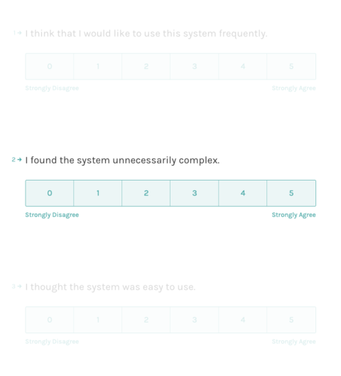
For the SUS, subjects should state to what extent they agree with 10 statements on a scale of 1 to 5. For example, ranging from 1 (‘I strongly disagree’) to 5 (‘I strongly agree’).
The 10 statements are:
- I think that I would like to use this system more frequently.
- I found the system unnecessarily complex.
- I thought the system was easy to use.
- I think that I would need the support of a technical person to be able to use this system.
- I found the various functions in this system were well integrated.
- I thought there was too much inconsistency in this system.
- I would imagine that most people would learn to use this system very quickly.
- I found the system very cumbersome to use.
- I felt very confident using the system.
- I needed to learn a lot of things before I could get going with this system.
For scoring, the answers add up to a possible 100, i.e. a system with optimal usability would have an SUS score of 100. A score of 68 is considered ‘good’.
An implementation of the SUS questionnaire can look like this (here with Typeform).
SUPR-Q – Standardized User Experience Percentile Rank Questionnaire
The Standardized User Experience Percentile Rank Questionnaire (SUPR-Q) is very similar to the SUS. In this case, there are just eight questions that are posed to the test subjects upon completion of all tasks on a website. The principle, however, is the same and the results are similar.
On the other hand, you have to shell out 3,000 to 5,000 dollars per year if you want to implement SUPR-Q. Why should you do that? Because in return you get benchmarks enabling comparisons with other websites. This means that you can see where your website stands in terms of usability compared with other websites in your sector.
Of course, collecting and updating these values involves work – and that’s what the colleagues of Jeff Sauro, who developed the SUPR-Q, get paid for. If you have a large budget, that may be of interest to you. Here are some more details: SUPR-Q Product Description. Otherwise, simply stick to SUS, which you can use for free.
NASA-TLX – Task Load Index
The next suggestion is not a joke. You really can work with a metric that was developed by NASA. As you can imagine, usability is of more vital significance to NASA employees than it is to us mere mortals. For them, it is not a matter of an order not going through, but of whether a billion-dollar rocket goes off course and burns out in the atmosphere. Or even whether people might die because of an operational error.

To control the International Space Station, a lot of interfaces are needed. TLX is used in their development at NASA. Source: https://www.nasa.gov/mission_pages/station/research/experiments/2138.html
UXers working in the healthcare and transport sectors and in the control of industrial equipment have also been measuring the complexity of individual tasks using TLX since the 1980s. But this metric is not so well suited to websites and consumer apps. Mainly because it is rather demanding to answer the questions. The NASA-TLX questionnaire consists of six questions, which the user must cross off on a non-numbered scale of ‘very low’ to ‘very high’.
The questions are:
- How mentally demanding was the task?
- How physically demanding was the task?
- How hurried or rushed was the pace of the task?
- How successful were you in accomplishing what you were asked to do?
- How hard did you have to work to accomplish your level of performance?
- How insecure, discouraged, irritated, stressed, and annoyed were you?
The test subject must then weight these individual areas. If you do want to work with this method: below you will find some links to further information and, most important of all, the link to NASA’s free iOS app, with which you can do the data collection and also get the result of the analysis. It is very practical, and not rocket science.
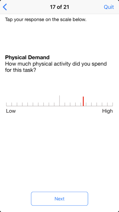
Example of a question from the NASA-TLX app.
NPS – Net Promoter Score
The next metric is rather controversial. There are some colleagues who completely reject the Net Promoter Score (NPS). And they have good reason to do so. More on this later. First, I will explain to you how you calculate the NPS.
Measure the NPS
After the test, you ask the users a single question:
- ‘How likely is it that you would recommend this system/application/website to a friend or colleague?’
The subject is then given possible answers on a scale of 0 (not likely at all) to 10 (highly likely). Whoever answers with a 9 or 10 is called a Promoter. Those who answer with a 7 or 8 are Passives and those with a score of 6 or less are Detractors.
The NPS is calculated by subtracting the percentage of customers who are Detractors from the percentage of customers who are Promoters. For example, if you have 40% Promoters and 10% Detractors, your NPS is 30.
In the worst case, the NPS is -100 – which means all of the respondents are Detractors. And in the best case it is 100 – which means all are promoters.
The NPS was originally developed to measure customer satisfaction or loyalty to brands or products, but it is also usable for websites or apps.
NPS – pros and cons
The NPS has three major advantages:
- It is very easy to determine.
- Many managers know it, especially if they come from business/marketing backgrounds.
- There is plenty of comparison data for companies from various sectors.
But criticisms of NPS, especially those expressed by colleagues in the UX area, include: With NPS we are doing something that we never actually do as good UX researchers: we ask the test subjects about what they want to do in future. The problem here is that Such questions are very difficult to answer. When we are asked if we want to eat healthy food and do regular exercise in the coming month, many of us say yes. Significantly fewer of us actually do so, however. The same thing applies with many questions about future behaviour. As UX researchers, we therefore much prefer to ask about things that happened in the past. The respondents can still tell fibs or simply have a mistaken memory, but the error rate is much lower.
A further major point of criticism is that NPS is based on a rather curious calculation method. The calculation is easy, but from a statistical perspective it is flawed. Because lots of information is lost even though it is actually there in the survey.
That becomes most apparent with an example:
- Let’s assume that a test gave a result of 0 Detractors, 75 Passives and 25 Promoters. This gives an NPS of 25. Not bad. Your colleague, on the other hand, has 40 Detractors, 0 Passives and 65 Promoters. Is the colleague’s result better or worse than yours? The NPS is exactly the same, namely 25. This shows that when you calculate the NPS, some information gets lost, because it makes a big difference whether 65 of your test subjects find your product super or only 25.
NPS works – when you apply it correctly
Does that mean you should not touch NPS with a bargepole? Not necessarily, from my point of view. Because many of our 2. Selecting the right metrics 19 / 34 non-UX colleagues find the NPS super. And you can gain credit with them if you can show that you have used NPS for your tests. Therefore, here’s my tip: if this applies in your case, then measure the NPS but do not work only with the NPS value but also with the raw data.
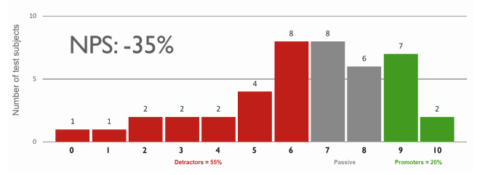
The scores of all subjects taking part in the NPS as a histogram (bar chart).
The raw data is always best presented in the form of a histogram. So you can see at a glance how the values of the NPS are calculated and whether the product under examination polarises opinion, or the evaluations are closer together. If, however, you find out in your analysis of the required metrics that there is no specific interest in NPS in the company, then I personally would not introduce it. As a rule, SUS is the preferred choice.
CES – Customer Effort Score
The Customer Effort Score (CES) is very similar to NPS. It measures the effort that the customer has invested in solving a task – such as in the execution of an order or submitting a support request. CES functions according to the same principle as NPS: the 2. Selecting the right metrics 20 / 34 Users are asked to answer a single question after interacting with the company or product.
With CES, this is:
- ‘The company made it easy for me to handle my issue.’ The answer options range on a seven-term scale of ‘strongly agree’ to ‘strongly disagree’.
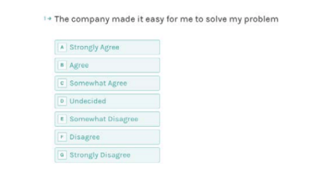
Example of determining CES with Typeform.
For the analysis, I determine the average of the answers (1 stands for very simple, 7 for very difficult); this gives me the average grade, so to speak.
Why should you use CES rather than NPS? The main reason is that the way the question is formulated switches the focus: with CES, I am not asking the user about possible future behaviour but, rather, about the user’s specific recent experience with me. That is a sounder approach. And the creators of CES say that effort is the most important indicator of whether a customer will come back in future.
Do not forget: the follow-up question
Very important with all the focus on the subject of metrics: never lose sight of the qualitative aspects. If you collect metrics such as the NPS or CES on the website or in a survey independently of a usability test, then you should always ask a follow-up question:
- Could you briefly explain the reason for your assessment?
Only by asking this question can you get a feel for what is working well, and what not so well. Otherwise you will only know that something is not right, but you will have no idea which problem your users are having specifically.
Alternative metrics
Alongside the metrics that I have already presented, there are a few others that are more widely used. You can supplement your methodological toolbox, especially if colleagues collect these metrics anyway; this means you get other options without much additional effort.
From a UX perspective, they are not of much use, as they go into great detail and do not say much without the context. For example, the simple statement that the average task completion time (TCT) for a particular task is 39 seconds is not enough on its own. For a purchase in a shop, this can be a fast time – entering payment data, etc. usually takes significantly longer. For unlocking a rental bike, however, 39 seconds is quite long – many apps do that in half the time.
TCR – Task Completion Rate
The task completion rate (TCR) indicates the percentage of test subjects who were able to complete the task successfully. That is, you divide the number of successful test subjects by the total number of subjects.
You can determine this value even for very small UX studies. Above all, it makes sense to identify at a glance the tasks that created the most problems.
TCT – Task Completion Time
The task completion time (TCT) is the average time in minutes or seconds that test subjects took to complete the task. You must interpret the number carefully – it is clear that some tasks take longer than others. Most users manage to sign up for a newsletter in just a few seconds, whereas they take several minutes to complete an order that involves entering address and payment details.
CR – Conversion Rate
The conversion rate (CR) tells you what percentage of visitors did what you wanted them to. Such as how many visitors to your website subscribed to the newsletter. Or how many visitors to your landing page ultimately became buyers.
AOV – Average Order Value
The average order value (AOV – average order value, expressed in euros, Swiss francs, etc.) indicates how much customers have purchased on average when placing an order. This value should also be interpreted with caution, because it depends on many factors that you partly cannot influence (for example, it is usually the case that more is ordered in a shop before Christmas).
Classic web analytics (bounce rate, pages per visit…)
Finally, there are the classic metrics that Google Analytics and other tracking systems provide. On their own, these are not suited to measuring UX, because they depend on many parameters that we cannot control. That said, such values can serve as a clue to tell us where we should take a closer look – especially if they change suddenly.
An example: suppose the bounce rate suddenly shoots up on your website. This means that many visitors leave your website without visiting any second page. They might come from Google, take a look at your home page, then disappear.
This could be a bad sign: visitors find your site so untrustworthy that they leave immediately.
But this could equally be a very good sign, meaning that the visitors find exactly what they are looking for on the first page. This might be the case if they find your telephone number, for example. The users want to get in touch by phone, so they are finished with their visit as soon as they have your number.
Technical metrics (load time, Google Lighthouse, WCAG Score…)
Last but not least, there is another type of metric that I would like to share with you: in this case, they are values of a technical nature, but they also have a relevance for UX. This includes the load time, for example – because you must also have insight into this if you want a user-friendly website or application. If your site takes too long to load, this will annoy users. Perhaps they will even break off loading and go to the competition.
Loading time and some other factors are taken into account with the score that Google Lighthouse provides. These are all technical factors that nevertheless play a role for UX. You can determine them with the built-in tools of Google Chrome, for example.
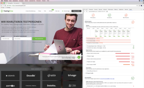
Google Lighthouse is integrated into Chrome. It performs a comprehensive audit of the technical parameters of every website.
And there are also accessibility scores that show how well your site complies with the Web Content Accessibility Guidelines (WCAG).
Only the comparison counts
Now we come to a point that is extremely important for all metrics: a single measurement says next to nothing, no matter which metric you choose.
You only get meaningful results if you make comparisons. Therefore, the NPS is useful for all issues in the UX environment: there are a variety of comparative values for different industry sectors. That’s why people also pay thousands of euros for SUPR-Q licences. The benchmarks they get for their fees really help them assess their own position.
However, for most teams it is much easier and, above all, more cost-effective to collect their own benchmarks. They also have the enormous advantage that they are truly reliable. Because you know precisely how your own values have come about. And you can ensure that this is always the same for every single measurement.
In general, you can employ two types of comparison:
- Comparison between different tasks / functions / products / companies
- Comparison of the same metric at different times
And you should employ both of these comparisons.
So you can see, for example, with what degree of ease or difficulty participants in your usability test have completed the respective tasks. So you compare the values arrived at with the SEQ with the individual tasks of the test. Or you compare the TCR, i.e. the proportion of users who were able to complete the respective task successfully.
It is also very rewarding if you not only look at an application but also collect the same metrics in a test of a competitor’s application. So you can see very clearly how you perform in comparison.
It is equally interesting to compare the metrics you got at particular times. For example, you can see quite clearly whether a revision or a new feature will improve or worsen the application as a whole.
Tips for introducing metrics to the team
Now I’ve introduced you to a whole series of metrics that you can use. If you are still unsure which of them is best suited to your particular needs, here are a few more tips:
Limit yourself to a few metrics
It might be tempting to measure as much as possible. Then you don’t have to decide just yet. But this is not sensible, for a number of reasons. First, it is difficult to do several things properly at once. And second, we humans are not designed to keep an eye on many things at the same time. This is especially true with figures. The more metrics you gather, the more difficult you make it for yourself to keep an eye on their development and to make meaningful comparisons. And that’s even more so for all your colleagues or bosses who are not so deeply involved with the material. You will then have to explain lots of things to them over and over.
And there’s another very important aspect to this: the more questions you ask, the fewer good responses you get. If answering the questions is voluntary (e.g. with an online survey), then the number of participants will reduce in line with the number of questions you ask. And even if all questions are answered – the respondents will get tired and are more likely to give false or incomplete answers the longer the questionnaire is.
And if you conduct user tests with test subjects in the Uselab: users’ time is far too valuable to waste with questions whose answers are not really essential.
Plan the presentation of metrics
If you proceeded in the way I recommended above, then you will have conducted an audience analysis of those who should make use of your metrics later. So you know how much basic statistical knowledge you can assume on the part of your stakeholders.
You should then keep the presentation more or less easy according to this level of knowledge. In general, few people can cope with raw numbers. The majority would find it easier if you provided the results in a diagram. You could write volumes, but as a rule of thumb, the bar chart is almost always the best representation for UX. This way you cannot go far wrong.
Pie charts are hard to interpret if they have more than four or five pie slices. And it is even harder to compare pie charts.
Scientists like boxplots. These are kind of like advanced bar charts with ‘antennas’.
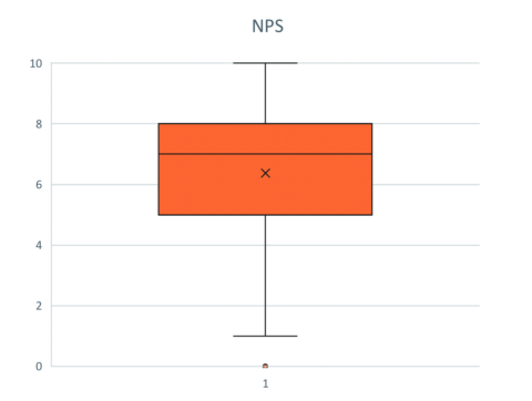
A boxplot. The antennas indicate the minimum and maximum values, the box 50 percent of the values.
This presentation makes it possible to get a good impression of the distribution of the measured values at a glance. Since reading these diagrams requires some practice, I advise against using boxplots in presentations intended for broad audiences.
Provide reading aids and manage expectations
Especially when you start working with metrics, it is important to keep an eye on whether everyone understands what you’re measuring. For this reason, it is not a good idea simply to distribute the first results in the form of a report; it is much better to arrange for a short workshop. This will give you an opportunity to explain why you are measuring, and what you want to achieve by measuring.
In addition, you can get feedback on how well the stakeholders are getting to grips with the metrics and their presentation. You can also find out what other questions they have that you might be able to answer with the same metrics.
Another important point is that you can manage their expectations somewhat. Because metrics often create the expectation that the metrics will improve. You have some leverage here: on the one hand, you can use the metrics to demonstrate the value of work done by the UX team. But on the other, you also have to be prepared for critical questions if individual metrics do not develop as desired.
And now to the final point: with metrics, you must be careful not to put too much focus on numbers. All the lovely numbers can only be interpreted meaningfully if you continue to consider the qualitative aspects – these form the basis for any UX optimisation.
Summary
Metrics offer you the ability to become more professional: with metrics, you can give your own work an empirical basis. That is to say, you do not need to rely on your gut feeling to judge the severity of a problem, for example, or to estimate how much you can improve an application by taking a certain course of action.
In addition, metrics can help to communicate the value of UX internally. This will increase your worth as a UX team and can ensure that you are taken more and more seriously, are brought into projects earlier and – last but not least – are given a bigger budget.
I therefore recommend that you use SEQ with every usability test from now on; in other words, to ask the following question after each task: ‘How easy was that?’ Plus, you can record the task completion rate and task completion time – it only takes a little time, and you will soon have gathered a few metrics with which you can then make benchmark comparisons.
In the medium term, I would introduce a further, higher-level metric, i.e. one with which you can get an overall assessment. My favourite here is SUS, but if your company is already familiar with NPS, simply use it.
Download the eBook so you always have a reference work:
What are you waiting for? Go for it!