
Presenting results and feedback from users is not always easy. Especially when you want to convey the important findings from a sea of Likert-scale responses, comments, and feedback. Luckily, there’s R and RStudio.
What are R and RStudio?
R is a coding language used for statistical computing and graphics to help make sense of data. RStudio was created to help make R easier to use by including a code editor as well as debugging and visualisation tools. And the best part? RStudio is free, open source, and available for anyone to use.
More information about R and RStudio.
Why use RStudio for UX?
RStudio has been my saving grace when it comes to analysing responses from our users. Not only did it help me present my data with easy-to-interpret graphs to visualise our users’ feedback. I also learnt how to ‘mine’ text when our users left comments, how to conduct a wide range of significance tests, and how to turn all of this into quantifiable results.
Calculating Sample Sizes
We all know that sample size is key to get good, precise results. There are many free resources out there that can calculate your sample size. But they don’t always take into account your study design. For instance, a usability test with 5 participants will identify the obvious issues that affect at least 30% of users who use your product. But what if we want to do a survey, card-sorting study, A/B test or benchmark a usability test? Now, a sample size of approximately a few hundred, or, in some cases, a thousand is needed.
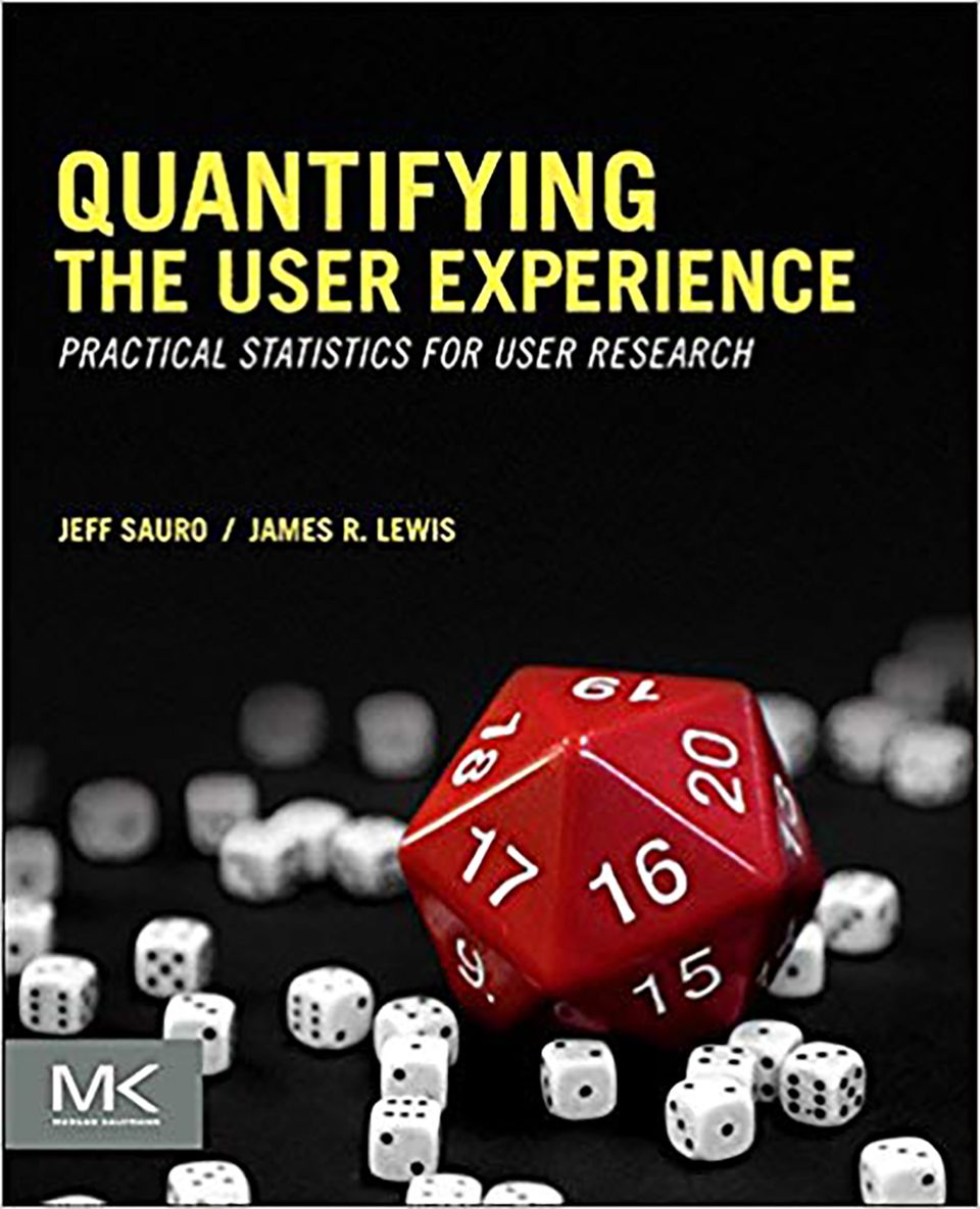
R has a lot of packages available that can calculate sample sizes, such as the pwr package or sample size package. Should you need help with sample size-related questions, I would recommend a book called Quantifying the User Experience: Practical Statistics for User Research. This book is a great guide for calculating sample sizes for all sorts of different tests in R. It provides a range of case studies, making it easy to decide which function you need to calculate the sample size that fits your test. And the best part is you need very little coding experience. The book gives you an overview of how to download R and RStudio followed by how to load their tailor-made functions. Read it and you’re good to go!
More information on sample sizes for research designs.
Data Visualisation
There are so many great ways to plot your data in RStudio: bar graphs, radar/spider plots, histograms, scatter plots, networks of words… And it doesn’t stop there. All types of data can be visualised: from categorical, discrete, or continuous data to mining text such as comments, tweets, or news articles. So here are a couple of R packages I recommend you try out.
ggplot2
One of my first projects involved sending out multiple questionnaires to our users about a number of different aspects of our product. We got a few hundred responses per questionnaire and my job was to communicate the results to the team. I was already familiar with using the ggplot2 package and decided to give it a try on this data. It worked out brilliantly! And here’s why:
ggplot2 has a wide range of graphs to choose from. Also, there are lots of options to customise your graphs so that they look the way you want them to. Creating graphs in ggplot2 is easy and logical: start with a basic graph in your first line of code, then customise it as much as you like, step-by-step right down to the colours of your data points. The ggplot2 cheat sheet provides a visual guide for which plots might be best for your data. This comes in particularly handy when I want multiple questions to be shown in one graph.
Let’s look at an example.
Imagine you want to plot a stacked bar plot of a survey asking users how they would rate each feature. You would like to plot the answers to each feature (A to H) against the number of responses (count) and stack or fill the different bar plots by the ratings.
As shown below, the different features are plotted along the x-axis and the ratings are used as the ‘fill’ in the stacked bar graphs.
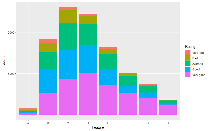 This is a great way to visualise multiple rating-scale questions that all have the same discrete scale in one plot, and you can easily see the comparison between how each feature was rated as well as the difference in the number of users who rated each feature. The flexibility of ggplot2 also means that you can re-label your axes, adjust the scales, colours, and so on.
More information on ggplot2.
Plotly
Another R package that I use, especially when time is short, is the Plotly package. If you need to quickly create a graph and share it with colleagues, this is the package to use. It’s not as customisable as ggplot2. But it’s fast and flexible and it can be used to create web-based graphs with the open-source JavaScript graphing package plotly.js. Don’t worry, it’s not complicated to set up – just follow these 3 simple steps:
- Create a free Plotly account.
- Save your authentication credentials (your username and your API key) and run these commands in R:
Sys.setenv(“plotly_username”=”your_plotly_username”)
Sys.setenv(“plotly_api_key”=”your_api_key”) - Publish your graphs to Plotly using the function:
api_create()
And you’re done! Your graph will be uploaded into your Plotly account where you can view it and send it to your colleagues.
But what about privacy? Can anyone view these graphs?
Plotly offers 3 privacy versions for you to choose from. The free version sets all uploaded graphs to ‘public’ by default. This means that the graph you upload will appear in your profile and possibly in search engine results. Plotly also offers a ‘private’ version – only you can view this graph unless you share it with other users who are in your online Plotly account – and a ‘secret’ version allowing only people with the link to view the graph. It won’t appear in the Plotly feed, your profile, or in search engine results.
More information on Plotly.
Testing for Significant Differences
When I first started working as a UX researcher, I still had the mindset of an academic researcher. I was looking for significant differences in everything! But I soon learnt that UX research isn’t about finding a significant difference between designs, products, or opinions. It’s about observing what our users struggle with based on what they do and what they think. And it’s about taking these observations and quantifying them to give us the best chance of making successful improvements.
I’m going to refer back to the book Quantifying the User Experience: Practical Statistics for User Research here. This book helped me to transition from psychology research to UX research and to understand when to test for significant differences.
Let’s look at an example.
A sample of users is presented with 3 different designs and asked which one they prefer. By looking at the confidence interval, you can calculate whether there is a significant difference between the 3 designs, check whether this is due to actual ‘true’ choice or random chance, and estimate the percentage of all your users who would also prefer the winning design. In other words, you can check whether your users really do have a preference.
More information on testing preference data.
Text Mining
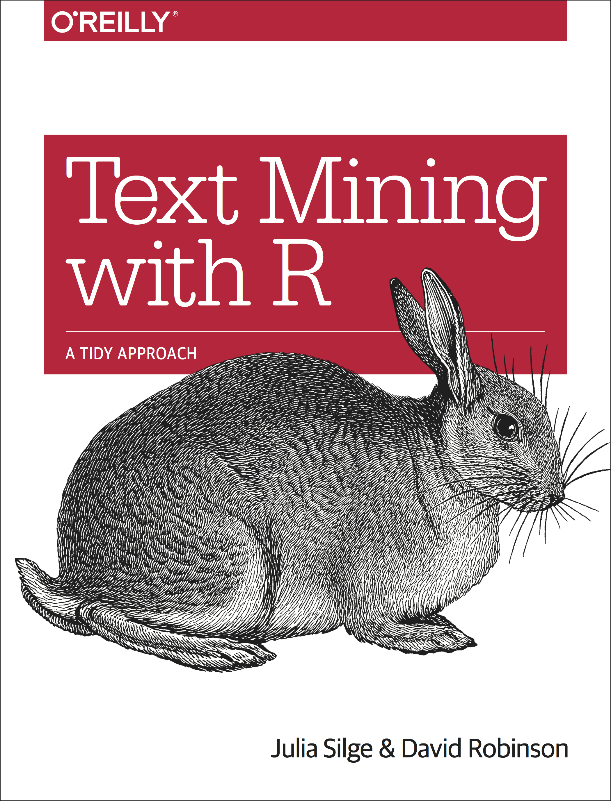
Last but not least, here’s a way to quantify any written feedback you receive through surveys, reports, forums, even Twitter! Text mining has been by far the most challenging and the most rewarding task I have attempted in R so far. Julia Silge and David Robinson, the authors of Text Mining with R, have done a brilliant job in breaking down this huge project into easy, understandable chapters and case studies. I went through them all (honestly!) and tried out each section to see which method(s) best suited my needs. Feel free to check out some of my favourite methods here.
Text mining can be used to do the following:
- Clean and organise your data
- Analyse word and document frequencies
- Conduct a sentiment analysis
- Look at the relationships between words
- Create topic models
Depending on the text you wish to analyse, some of these methods will be more relevant than others. I usually receive feedback from reviews, surveys, customer support, and so on and the texts are usually no longer than a couple of sentences. On occasion, they can be as short as a single word. So I tend to use the following methods:
Cleaning and organising the data
Cleaning your data is vital to filter out all the unimportant words, such as ‘is,’ ‘as,’ ‘the,’ ‘and,’ and so on. The main reason for filtering out these words is so that only the interesting, important words are analysed later on. A custom word list can also be used, for example, if there are certain words that you would like to leave in or remove that weren’t included.
Keeping your data organised helps assure that each piece of feedback is kept separate within each question or each product. Additionally, you can retrace where the feedback came from, for example, a survey, a forum, or a tweet/re-tweet. It is also possible to separate the feedback, for example by sentence or with commata. This comes in particularly handy when a user has left detailed feedback about different parts of your product and you would like to separate each part so as not to miss anything.
Analysing word frequencies
Looking at the word frequencies can already give us an indication of how our users are perceiving our product, for example, if we have just released a new feature. We may start seeing certain words occurring more frequently than before the feature was released. But words without context can be confusing and misleading which is why it’s wise to conduct some further analyses.
Conducting a sentiment analysis
Sentiment analyses are useful for 2 things: firstly, for getting an idea of how many positive and negative words occurred and secondly, for checking how many words may have been wrongly perceived. For example, a positive word that succeeded a negating word such as ‘not’ may have been falsely categorised as positive. You should conduct both of these checks, especially if common negating words (like ‘not’) occur frequently in your text.
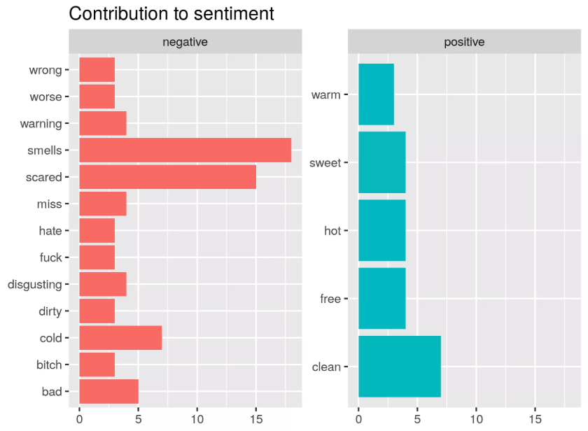
Tap Water Sentiment Analysis using Tidytext. Source: r-craft.org
Looking at the relationships between words
This is probably the analysis that I get the most information from. By exploring how words relate to each other, we can uncover the order in which words occur and whether they co-occur between or within products. This can be done by looking at pairs of words or 3 (or more) words in a row and calculating their frequencies and sentiments in these word groups. The book contains a nice example of how this works using Jane Austen’s published novels. A treat for classic literature fans!
More information on text mining.
A world of possibilities
In conclusion, I highly recommend using R and RStudio to calculate sample sizes, visualise data, test for significant differences, and quantify written feedback. That said, R can do a lot more than this: CRAN, the global repository of open-source packages that extend the capabilities of R, has more than 10,000 packages available for download.
Which ones do you use and when? I look forward to hearing about your experiences and recommendations in the comments!