Table of contents
1. Why you should do visual design testing
2. How to do visual design testing
2.1 Five Second Tests: what stands out?
2.2 Word Choice Tests: What values does the design reflect?
2.3 Visual A/B Testing
3. What to bear in mind when doing visual design testing
3.1 Tip #1: Start small
3.2 Tip #2: Define your research design and research question clearly
3.3 Tip #3: Choose your participants carefully
1. Why you should do visual design testing
Imagine you and the project team are sitting in a meeting. You are discussing the visual design of the product you’re working on. You look at the prototype that shows the planned colours, typography and icons – and somehow you feel like “something is not quite right.” But what isn’t right? Does the design not reflect the product vision? Is it too chaotic because there are too many colours? Or – let’s be completely honest – do you simply not like blue?
When it comes to discussing the visual aspects of a product, different opinions meet. Discussions get emotional and a lot of times it is unclear whether these opinions are individual preferences or actual user needs. In order to find out the difference, it is worth conducting a visual design testing.
By conducting a visual design testing, we can find out if a design actually responds to user needs. It is a way of objectively describing and interpreting the feelings associated with the visual aspects of a product. It allows us to check whether a design accurately represents the product vision, or in other words: if it reflects what it is supposed to reflect. How exactly we go about testing a visual design depends on what we would like to find out.
2. How to do visual design testing
Wouldn’t it be easiest to simply ask users what they like better, the blue or the red version of the design? Unfortunately, a simple question like this can be misleading. It can lead people to give a “dishonest” answer and tell us (consciously or not) what they think we want to hear. On top of that, visual preferences change, depend on context and are hard to put into words. Hence, what we need in order to test visual design is a structured and standardised procedure.
In the following sections, we briefly describe three established testing methods. Which one to use depends on what you want to evaluate:
- Five Second Tests can be used to test salience
- Word Choice Tests can be used to test how well design and product vision match
- Visual A/B Testing (e.g. with AttrakDiff) can be used to find out user preferences
2.1 Five Second Tests: What stands out?
The first impression is the most important one – and it’s exactly that, which we can evaluate with a five second test. You might have already guessed it from the name: For this test, we show the design to our potential user for five seconds. After that, we ask what the person remembers. It is a very simple way of determining what stands out and influences the first impression.
What question we ask after five seconds depends on our research goal. If we want to know how salient a call to action is, we can ask something along the lines of “What did you see?”, whereas a question like “What do you think this website is about?” aims to find out whether the content of the website is obvious to the user.
 Five Second Test in action. Image credit: Nothing AG
A Five Second Test is a reliable and cheap method to get quick feedback. It does not need a lot of preparation and can be conducted spontaneously with random people in a café but also before a scheduled, more in-depth user interview. What the test does not offer is a more detailed report of the emotional response a user has to the design. For that, we need to use another method, like a Word Choice Test or AttrakDiff.
Further information on Five Second Tests:
The book „The UX Five-Second Rules“ offers an extensive overview of this testing method.
2.2 Word choice: What values does the design reflect?
Design starts when we define a strategy and articulate a product vision. This vision should be reflected in the product as a whole – including its visual design. But how can we be sure the visual design actually reflects the product vision? To assess this, we can use a Word Choice Test, also known as “desirability testing”.
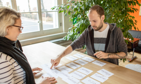
In a Word Choice Test, we show the participants a part of the design together with adjectives that could describe it, for example: trust-worthy, patronizing, professional. Then we ask the participants to choose the terms that in their opinion describe the design best, and invite them to explain why they chose exactly these adjectives. It can be helpful to start out with a Word Choice Test, continue with an open interview and, at the end of the encounter, come back to the words that people chose in the beginning. The discussion in between will often lead them to give more details and a more nuanced reflection on why they chose exactly those words.
 Word Choice Test in action. Image credit: Nothing AG
Make sure to invest enough in the preparation of the testing (i.e. the research design). If you don’t know what you want to find out and show your participants random adjectives, your findings will be of limited use. Instead, come up with words that sum up the product vision and include these in your word list. Like this, we are able to test whether the design reflects the product vision or not.
Further information on Word Choice Tests:
- Joey Benedeck and Trish Miner’s paper on Microsoft’s Reaction Card Method – this paper from 2002 is said to mark the origins of desirability testing.
- Kate Moran describes in detail how to prepare and conduct a Word Choice Test
2.3 Visual A/B Testing
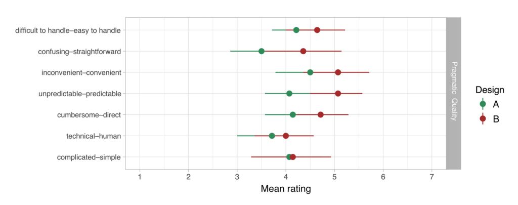
So which version of the design do users prefer? Do they like the blue one or rather not? As easy as this question sounds, it is more complex than it seems. If we want to figure out what users actually think, the AttrakDiff questionnaire comes in handy. With this questionnaire, we can test the usability, emotional value and attractiveness of a design using standardized questions.
Similarly to word choice tests, we show potential users a part of the visual design and let them rate it with adjectives. However, testers don’t just choose words from a list, but grade the design with opposing adjective pairs (e.g. “human – technical”). For instance, “confusing – clear” aims to test usability, while “conservative – innovative” investigates the emotional value of a design.
 Visual A/B Testing with AttrakDiff. Image credit: Nothing AG
Other than with a word choice test, the data from an AttrakDiff questionnaire can easily be analysed statistically. Like this, we can compare two versions of a design in the sense of a visual A/B testing.
Further information on AttrakDiff:
- AttrakDiff is based on Marc Hassenzahl’s research: more information about the science behind AttrakDiff and scientific publications on AttrakDiff
- AttrakDiff uses a Semantic Differential rating scale. This is a common way of measuring attitudes and can also be used differently, as Deborah Levinson’s article “Using semantic differentials
to evaluate visual design preferences” shows.
Each of these three methods has its advantages and disadvantages. Which one we use depends on our research goals. There are, however, some general dos and don’ts to bear in mind to make sure your research will be a success.
3. What to bear in mind when doing visual design testing
Visual design testing is about objectively evaluating the visual aspects of a product. These aspects include colours, typography and also icons. When testing, we want to find out more than simply “I don’t like red” – we want to find out what about our design triggers which emotions. How we go about finding out such emotions and triggers depends on our research question.
The three methods we presented here – Five Second Tests, Word Choice Testing, and AttrakDiff – can be combined with one another or extended with other methods. We particularly recommend combining quantitative methods (e.g. an AttrakDiff questionnaire) with qualitative methods (e.g. interviews). Apart from that, these are our top three tips in a nutshell:
3.1 Tip #1: Start small
Don’t try to test everything at once: the product vision, the first impression, the whole design and, and, and… It is worth downsizing and conducting several small studies instead of one massive study. Also, it can make sense to start with a small pilot study, or to at the very least try your research design with a colleague. Like this, you can save time and money by first finding out if you are headed in the right direction.
3.2 Tip #2: Define your research design and research questions clearly
Nothing is more hazardous than collecting data without defining what you actually want to find out. Because if you don’t, you’ll be tempted to simply make the data say whatever you want it to say. Sounds like a no-brainer but if you don’t have a clear research question, it can ruin the whole study. Your research results will always mirror your research design. So make sure to come well-prepared.
3.3 Tip #3: Choose your participants carefully
Sounds obvious, but people tend to forget nonetheless: If we want to find out how potential users react to a design, it makes sense to test it with, well, them. At the beginning of a project we often interview users and create personas, i.e. personified representations of user behaviour. When looking for participants for our study, we make sure that they represent these personas as accurately as possible.
While studies such as usability testings and user interviews are starting to become more and more established, visual design is still surprisingly rarely tested. When it comes to visual aspects, we rely on feelings and personal preferences – our own or those of other stakeholders. But visual design, too, can be evaluated more objectively than “well, I just don’t like blue here.” So, try it out and integrate it into your next project.
If you’ve got questions, do get in touch – we’d love to exchange. Needless to say, we can also support you in a concrete research project.

