Table of contents
1. Ginetta and TestingTime for human-centered design
2. Challenge: Different users with different goals
3. Solution: A good concept with a fresh look
4. A well-thought-out story
5. Early testing is king
6. Make it look like we wanted it to feel
7. Conclusion: Empower your audience by creating a world that’s beautiful and easy-to-walk-through
1. Ginetta and TestingTime for human-centered design
Ginetta is a digital agency that specializes in human-centered design and development. The experiences they create are fast, simple, and beautiful. Like TestingTime, Ginetta focuses on the user, and helps customers to thrive in the digital world.
When we at TestingTime decided to freshen up our two key landing pages—the customer’s homepage and the test user signup page—it was a no brainer to involve Ginetta in the project. With story-driven pages and a fresh look, we made searching for the right test users and signing up as a test user into much easier, more efficient and enjoyable experiences.
From initial discussions about the project scope to the design of the prototypes as well as the research work, it was all very professional. Both teams, the project team on Ginetta’s side and ours, have always worked together as one team throughout the whole process. Despite the difficult timeline, we have received the usual Ginetta quality: our two key landing pages are simple, beautiful, and easy to use.
2. Challenge: Different users with different goals
The people that visit our website have different goals and needs. On the one hand, we have UX researchers, product managers, market researchers and other people interested in our recruiting service. They are looking for test users and other study participants in order to organise or schedule their user tests and studies.
The other target audience comprises people who want to sign up as testers. They are interested in participating in user tests, want to share their feedback and get paid for it.
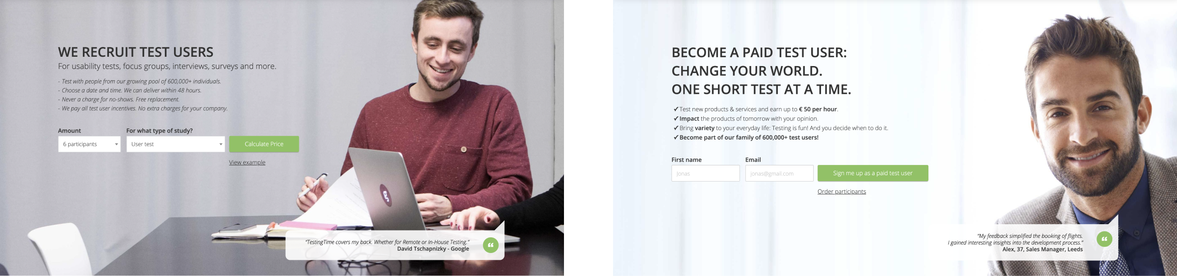
Entry to the old customer homepage and tester sign up page.
Our goal was to create a place where everyone could easily find what they were looking for. Ginetta chose a storytelling format to achieve this in a wonderfully entertaining way.
3. Solution: A good concept with a fresh look
To engage the two target groups and enhance usability, Ginetta created user-centered stories and a new design concept they had tested early on. Working with our team, they redesigned two key landing pages: one for customers wanting to test their products and the other for (potential) testers wanting to sign up.
Additionally, they improved access to the tester page, where visitors had found themselves landing on the customer page or even getting lost in the order form when they should have been signing up as testers.
4. A well-thought story
At the very beginning of the project, together with Ginetta, we identified the relevant topics for the different audiences. First of all, what are they looking for when they visit our website? Secondly, what are the desires and tasks they want to fulfill? And last but not least, what problems do they have that TestingTime can solve?
To start with, Ginetta used the semantic differential measurement technique to obtain a common understanding of how the pages should look and feel to the audience. The semantic differential measurement technique is a form of rating scale that is designed to identify the connotative meaning of objects, words, and concepts. Based on the results, we defined design principles to keep us on track during the project.
Drawing on some of our previous research work, Ginetta made the audience the central character in the appealing stories they were developing. At this point, Ginetta was focusing on the text rather than the page structure. This approach allowed them to make the pages story- rather than element-driven. The result: more relevant and interesting pages to scroll through.
Storytelling is a unique way to develop an understanding and can enhance understanding and communication.
5. Early testing is king
Something we never stress enough: Early testing always pays off! So when Ginetta’s story was looking good, they quickly iterated on very simple page layouts and ended up with a mid-fi prototype that was enough to get the most out of a first test. At the end of each test, they asked the testers to rate what they saw with the semantic differential that we defined during the kickoff workshop. This showed us how their feelings about the page lined up with our goal. Of course, we have taken over the recruitment of testers.
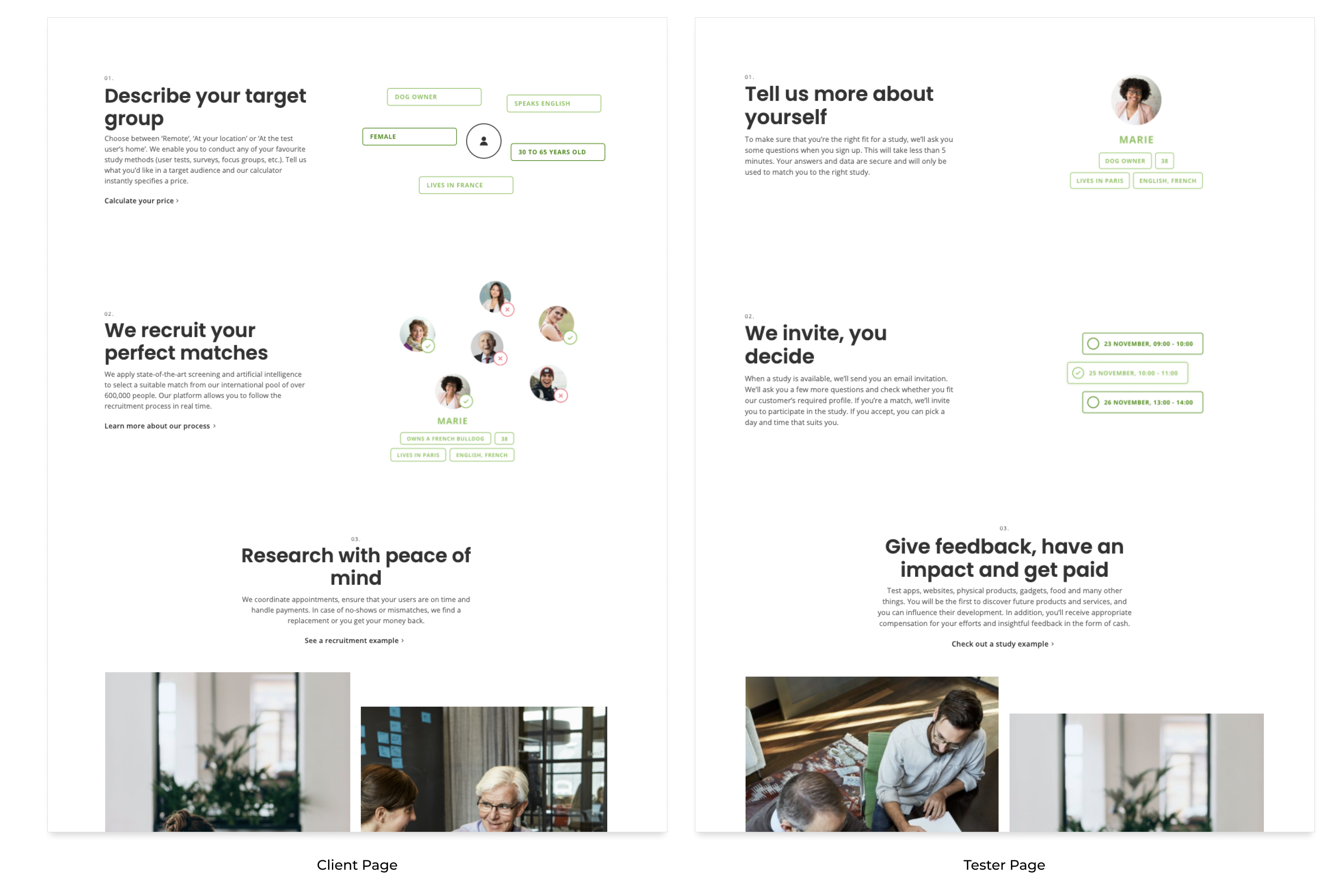
This first prototype which Ginetta tested.
6. Make it look like we wanted it to feel
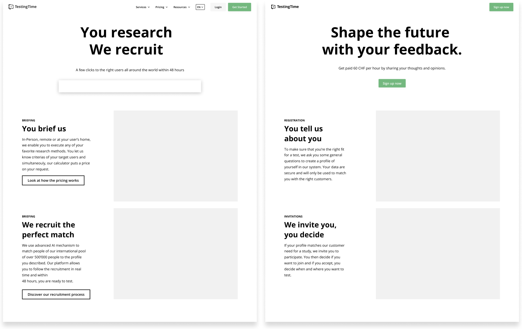
After improving the concept based on feedback from the testers, Ginetta invested time in the visual design. While still following our brand and design system, Ginetta worked on new elements that would convey the way they wanted the page to feel. This included the creation of illustrations, motion design, and typography. After they tested the final concept a second time, it reached our expectations.
7. Conclusion: Empower your audience by creating a beautiful, easy-to-walk-through world
Saying that your product or service is the best is not enough. You have to give your audience the chance to see the true value of your offering. You can do this by telling a story they can identify with and empowering them to be part of it. Ginetta achieved this by analysing the audience and their needs and reflecting them in the text and design. Users can now move more easily and quickly through our website and see what we have to offer. This was only made possible by speaking with the audience. It reminds us that even when time is limited, user research is crucial.
About Ginetta
Ginetta creates websites and apps that click with users. Great design is not only about how it looks, it’s rather how it works. As a leading digital agency, they connect the dots between content and client. Their websites and apps are simple, beautiful and intuitive. Explore their work: https://made.ginetta.net/