Table of contents
1. Create an attractive webpage
2. Utilise white space
3. Make webpage available on all devices
4. Check the loading speed of the website
5. Have visuals
6. Have a good call-to-action
7. Do something about broken links
8. Demonstrate exceptional readability
9. Throw out unnecessary stuff
10. Ensure contact information is complete
11. Display a search box
1. Create an attractive webpage
What makes an attractive webpage? This is something that you have to figure out when creating your page.
Usually, the entry page is the place where you include your companies’ main messages – ones that you want your viewers to understand, meaning that not all of your messages should be displayed on the homepage. Placing everything on one website not only annoys your audience but also makes for poor User Experience, which then also results in visitors leaving your site faster than they had arrived. So, keep these points in mind, when creating a good-quality webpage:
- Instead of a block of text, keep the text short and sweet.
- Remember that on your homepage, the most important essential content should be placed above the fold.
- Keep in mind that every other page on your website should be connected with the main page.
- Should you use a logo, it should be linked with the entry page.
2. Utilise white space
“There’s nothing wrong with having space on your webpage,” says Arthur Masterson, a marketer at Writemyx and Nextcoursework. “Often referred to as ‘white space,’ empty spaces can help your page be more readable to users that visit the site. Since visitors naturally look at the most important information in any part of the page, make sure to keep enough breathing space on there to make things look more professional. To pull it off, you should have enough white space around text and titles increases users’ attention by 20%.”
So, what are the benefits of having enough white space? Breathing can make:
- your website feel open, modern and fresh.
- it less likely for users to miss the most valuable information.
- your website coherent, and not confusing or crowd.
“Your job here is to grab the user’s attention,” adds Masterson, “or else you’ll risk losing them and not making enough conversions from your site.”
3. Make webpage available on all devices
As more and more users use other devices – smartphones, tablets, etc. – besides computers, to access a website. That’s where responsiveness comes into play because it’s a crucial part of UX design. Responsiveness allows websites to change layouts, based on how their audiences are viewing them, whether on a desktop, tablet or smartphone. With people on the go, at home, at work, or wherever, responsive designs ensure that your website looks perfect from all of their devices.
Whereas, a broken website design – a design NOT compatible with many devices other than desktop – scares mobile users away. If your site is lacking in quality when people try to access it on, say, a smartphone or tablet, then they won’t bother venturing further on the page, thus making you lose some potential customers if your website is not responsive.
Therefore, make sure that your website is responsive to every single device so that people can access and buy from your site no matter what devices they decide to use.
4. Check the loading speed of the website
Let’s face it: No one likes load pages. In fact, many users will either roll their eyes or scoff at the fact of staring at the buffering circle for a good while.
Most of the web visitors typically expect a website to load within 3 to 4 seconds. If your website’s loading time surpasses 4 seconds, then it’s obvious that the site’s quality won’t be as good and they’ll go somewhere else. Just imagine if these users were shopping at the mall, and they’re waiting in line for hours to be served – that same frustration applies here. Even a 2-second delay can get them to leave faster than they’ve arrived. So, let’s fix that!
Ensure that your loading time doesn’t exceed 2 seconds. This will require you going into your website’s coding and analytics, and seeing what thing(s) may be causing your site to slow down in its loading process.
5. Have visuals
Everyone likes seeing appealing visuals, including photos and videos. In fact, a website that utilises images and video to their advantage are able to grab the visitor’s attention easily, thus making them significant focal points on there.
First, images. They tend to humanize your website by displaying a human face – or faces – to your brand. Instead of being generic and robotic to users, you’re showing human proof, thus increasing your conversion rate just by having a happy image of customers on your homepage.
And then, you have the option of adding appealing videos to your site. Videos help to boost customer engagement through their viewership and their interactions with them. For example, if you want to show off a product and what features and functions that it has, you can add a tutorial (or explainer) video that demonstrates it – this video you can display on your homepage. Such a video allows users to understand that product more easily and accurately.
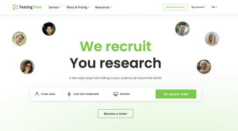
Source: www.testingtime.com
If people don’t understand how your product can help and how to use it then how would you expect to buy your product from you?
6. Have a good call-to-action
Call-To-Actions are essential, because they tell your audience what you want from them, once they watch your video, or read your post. CTAs are meant to attain higher conversions for your website.
CTAs can come in the following forms:
- Asking people to subscribe to your videos.
- Having people sign up for your newsletters with a dedicated button on the homepage.
- Having people take advantage of discounts and offer codes through flash sales and promos.
So, now that you have a clear idea of what forms CTAs can take, here are few things to consider while you design one:
- First, pick a CTA colour that contrasts with the background colour, so that it helps visitors find it easily. Now, when picking a colour, think psychology. Different colours can evoke different messages and signals. What kind of message do you want to convey in your CTA? Is your CTA urgent? Is your CTA special? What? Think about this when choosing a colour accordingly.
- Next, think about the text you use for your CTA button. Don’t use the texts “Link,” “Next,” “Submit” or “Continue.” Use something that tells visitors what they’ll get if they click on the button.
- Finally, place your CTA button just above the fold area in your website, so that people can see it instantly as soon as they arrive on your page.
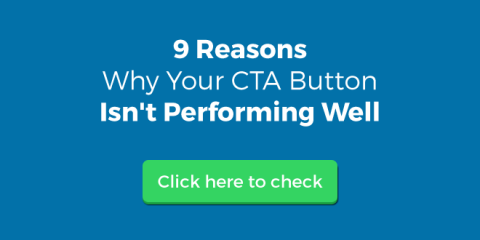
Source: www.sociableblog.com
7. Do something about broken links
Now, the last thing you want on your website are broken links. Such links are annoying and frustrating for users because when they click on a link, they expect to be taken to where they want to go. But, if that link fails to take them where they want to go, then they’ll grow frustrated and ditch their efforts to move forward. As a result, users will view your website, as a whole, as broken.
What happens when a user clicks on a broken link? Well, what happens is that users will be taken to a 404 error page (or something similar to that), which acts as a dead end, to where they leave the site to potentially seek solace in your competitor’s site.
So, how can you identify and fix the broken links?
Here’s how:
- Check the internal workings of your website. That means going to online tools like Google Webmaster to help you spot any broken links that you might not have been aware of. Plus, online resources offer free 404 checks for your site.
- Redirect the old page or post to a new URL, so that users aren’t taken to a 404 error. Or, if possible, redirect the URL to a page or post on a similar topic.
- Make a request that the old URLs be removed from search engine listings.
8. Demonstrate exceptional readability
As mentioned before, white space is important to have on your website, because it enforces the readability needed for users to be invested in what they’re seeing. Therefore, readability – good or bad – can affect a user’s experience.
“When structuring your content, you must figure out how you want your audience to consume and respond to your site,” says Abraham Kingston, a UX designer at Brit student and 1Day2write. “If users can’t read your content, they won’t respond to the site, and they’ll leave.”
So, when looking at how readable your content is, keep the following objectives in mind:
- Use short sentences in your content, as they are easy to read and understand by general audiences.
- Make the texts large enough (with an appropriate font), so that people can read them without squinting.
- Don’t be afraid to use bulleted lists to make your points.
- Why opt for a large paragraph, when you can either break it up into smaller paragraphs or condense it to make it shorter?
- Links can be underlined, not any other words. But generally, underlining should be done sparingly to make the user’s reading less convoluted.
- Just as white (or any other appropriate bright colour ) text should be bused on a black (or dark) background, use black text on a white background.
- Limit all paragraphs to no more than 2 lines.
If you’re interested in learning more about this topic, don’t miss this ultimate guide on how to write a great UX copy.
9. Throw out unnecessary stuff
Just like a cluttered room or house, your website needs some decluttering every once in a while. Yes, for better UX, you must get rid of the unnecessary elements from the website, and keep only the essentials – this allows you to gain more conversions by putting out and keeping relevant content.
To ensure that you’re getting rid of the unnecessary elements, be sure to look at the following, and consider removing them from the site as soon as possible:
- Unnecessary and or irrelevant ads (For example, old promos)
- Blinking banners
- Irrelevant images
- Social media accounts that you don’t use anymore
- Irrelevant testimonials and or reviews
10. Ensure contact information is complete
As you cater to visitors online, they have to be able to contact you from different avenues. If a customer has a question or concern, they’ll look for your contact page. Therefore, you must include the complete contact information on your website, so that visitors can contact you whenever they want.
So, when adding your contact info, here’s what to include:
- Your full company name
- Contact address (your main one, along with any other relevant locations if you have multiple)
- A working phone number
- A valid business email address
Now, whenever you’re displaying a phone number and email address, be sure to place them on the footer area of every page on your website. This tells potential customers that your site is legitimate, and that will establish trust, thus increasing your conversion rates.
11. Display a search box
Finally, you have to provide a way for potential customers to look for something on your website. If they get stuck or lost looking for something on your site, then they’ll be frustrated and will most likely leave.
As you can see, time is money. Customers don’t have time looking for things – they want to get to a product, and then buy it. Don’t be the site that has them searching and searching for a product. Add a search box on the top of the homepage, and make it visible for them to just go up, click, type in a product name, and then press the magnifying glass to commence searching.
Conclusion
As you view all of these 11 tips, it goes to show that your online business can’t survive without a high-quality UX – one that’s fast and flawless. By offering good UX, users will be willing to return to your site over and over again and become valued customers for years to come.