
Table of contents
1. The struggle of a new UX writer
2. How to write a great UX copy
2.1 Forget the product – sell the benefits
2.2 Reach out to target users
2.3 Speak the user’s language
2.4 Use appropriate language, tone and style
2.5 Keep it as short as possible
2.6 Make it empathic
1. The struggle of a new UX writer
Do you remember your first UX writing project? Perhaps, the first thing you remembered was the feeling of being overwhelmed. Studying user research results, doing testing, talking to the product team, writing a long copy, making iterations, getting customer feedback – the list goes on and on. For me, a copywriter who decided to try UX writing, “overwhelming” was the proper word to describe what I felt.
“I have no idea where to start.” This was my first thought when I started my first serious UX copywriting project. An extensive experience with writing blog posts didn’t prepare me for what was coming: Writing a copy for a SaaS app for tracking moving assets at manufacturing facilities.
How’s that for a challenge? Five years ago, there weren’t a lot of UX writers to hire. So, the company I worked for decided to “convert” a blog copywriter – that’s me – to a UX writer. After studying for a bit, I got into a project that taught me most I know about this microcopy.
2. How to write a great UX copy
Below, I’ll share six essential UX writing rules. Follow them, and you’ll know how to guide users within a product.
2.1 Forget the product – sell the benefits
“This feature helps to…” Let me stop you right there.
I’ll be brutally honest with you: no one cares about features.
Or the entire product, for that matter. All the users care about, is themselves. This means the benefits of your digital product are far more important to them than its features. So, don’t talk about how innovative and great your product is. Instead, talk about the real benefits it gives and the problems it solves. This is the only way to grab the attention of users and help them understand how to use the product.
Let me give you an example from the SaaS app I worked on. Which one of these feature description bits sounds more user-oriented?
- “Real-time asset monitoring.”
- “Track your moving assets to find them in real-time.”
A bit too industry-specific, I know, but bear with me. The first one describes what the feature does, so it’s more product-oriented. The second one talks about what the user can do. So, it’s more user-oriented. The second option creates the feeling of being in charge by considering the feature from the user’s perspective.
Takeaway: Make microcopy must help the user understand the value of the product. This is done by describing real benefits, not features.
2.2 Reach out to target users
Do you know how UX designers do usability testing? It’s a fast and effective way to learn about the users’ needs. As a UX writer, you can do something similar. A user interview can be immensely helpful in writing a great microcopy. Take it from my experience. I made a horrible mistake by not reaching out to target users. I simply wrote a copy based on user testing and online research. The result? A few serious rounds of copy iterations right before product launch. Ouch.
Then, one day, we made a field trip to a huge manufacturing facility. There, a team of managers was using our app to track the movement of forklifts – those industrial vehicles used for material lifting and moving. I sat down with one manager – the target user – to talk about the app and… In just 30 minutes, he gave a bunch of amazing insights. Here are some of them.
He told me:
- How they were using the features and what benefits they were interested in getting from them
- Features that were the most useful for them
- Main problems they were trying to solve with our app
- How we could improve the app to help them monitor assets more effectively.
Those insights were amazing. Basically, he told me how to write the copy! Here’s an example:
I chose the name “Real-Time Employee Tracking” for a feature that identified worker location and movement in the facility. Sounds good, right? Not exactly.
The manager said the name made little sense to him. Warehouse workers thought that “Employee Tracking” was the big-brother kind of system for checking how much time they worked. According to the manager, we should’ve named it “Real-Time Employee Location.” Employee tracking turned out not to be the primary goal of the feature. Instead of tracking, they used it to find the closest available workers to the place where help was needed. Employee tracking, according to the manager, would only be used to make sure the workers stayed away from potentially hazardous zones.
Amazing. I’d never have learned this by doing internet research.
Takeaway: get in touch with your users before writing microcopy. Better recruit test users from the intended audience and interview them. You won’t believe how many great microcopy ideas you’ll get.
2.3 Speak the user’s language
The meeting with the production manager had one more great insight for me. Within those 30 minutes, I’ve heard a bunch of professional terms they used to describe the product and features.
For example, this one:
“We’ve used tracking tags to monitor the movement of WIP and see where bottlenecks occurred, and waiting waste was created.”
There are two professional terms here:
- WIP
- Waiting waste.
Says nothing to an average person, right? But for the user, it was important.
Here’s how to make sense of those.
WIP stands for Work-in-Progress. It’s a term to refer to materials in the production stage. A huge deal for manufacturing managers, and here’s why.
 Source: Author’s screenshot
In simple language: the more WIP, the lower revenues. Next, waiting waste. It’s production equipment that’s sitting inactive. A Google search helps to understand why it’s important for our target user. Accordingly, it increases spending, which the user is trying to avoid.

Source: Author’s screenshot
This knowledge is gold for UX writers like you and me. To write a microcopy that makes sense to the manufacturing manager, we must use these words and terms. This way, we make the digital product “speak” their language.
Takeaway: The example of a manufacturing app is a bit extreme. But the moral is the same – find out what language your users prefer will go a long way to making a great UX copy. Even if it means individual words and terms.
2.4 Use appropriate language, tone and style
Think of UX copy as your side of a conversation with the user. Here, language and tone can make a lot of difference in how they perceive your product and business.
Besides, tone and style are important because they:
- Express the unique values of the business
- Build trust and make users more loyal
- Make the company more human
- Make it easy for users to understand the product’s value.
So, how to get the tone and style right?
The appropriate tone and style of UX writing get the point across quickly and effectively according to the context. There’s no way you can keep the same tone on every page or button because the context is different everywhere.
In different places throughout the digital product, you can be:
- Instructive
- Authoritative
- Serious.
The choice depends on the context and the emotional state of the user. If your app, for example, is helping a user to understand something in a hurry, you need to be clear and instructive. The welcome screen in an app is a good example. Your users don’t need to spend a lot of time here, so the message must be short and sweet.
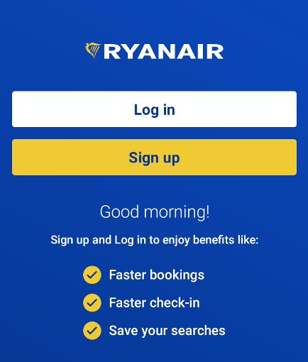
Source: Author’s screenshot
The message, in this case, also helps the user. If anyone is wondering, “Why do I need to sign up?”, the app gives a clear answer. Next, the UX copy must get clear and “serious” on pages like a privacy policy, knowledge base, or product usage instructions.
Take a look at this copy at Slack Help Center. It’s super concise, on-point, and instructive. To help people learn how to use the app, the writers did an amazing job at keeping an instructive yet friendly tone.
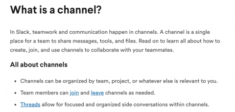
Source: Author’s screenshot
Note how the writer addresses the reader by “you” – it’s a great practice to create a feeling of a “conversation” with the user. In these cases, being too authoritative or using humour can make users feel annoyed, cautious, and sceptical.
Takeaway: the best choice of language tone and style for UX copy depends on the context. Keep in mind that the overarching theme of clarity and user-centeredness always stays true.
2.5 Keep it as short as possible
The best microcopy is concise. You won’t have enough space to write poems – plus, no one wants to read them – so brevity is a must. Clutter is a major no-no in website design, both in terms of design and UX copy.
To keep your UX copy short:
- Write shorter sentences. The longer the copy, the heavier the cognitive load.
- Don’t spend too much space on explanations. If you can’t explain an action in one or two sentences, you won’t explain it well in ten.
- Limit each paragraph to three sentences. This number keeps the text readable and user-friendly.
- Use headings and subheadings to break up content. This especially applies to writing longer texts like policies and usage instructions and helps to keep them scannable.
- Write in the present tense. It helps avoid passive voice and makes copy simpler and more digestible.
- Use specific verbs to describe actions. Instead of generic verbs like “get” and “make,” use more specific ones like “save,” “watch.”
Let’s now see a microcopy example that follows these rules. Here’s a section from Dropbox’s website. It’s a good example of a concise UX copy that uses specific verbs (“store,” “access,” “edit,” etc.), headings, subheadings, present tense, and summarises the benefits pretty well.
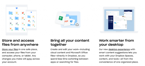
Source: Author’s screenshot
If there are no UX writers in your office, however, then consider hiring one from these sites. A professional can also help to train microcopy skills, too.
An Exercise to Train your UX Writing Skills
Practice UX writing by giving yourself tasks with word limits. For example, try to write an in-app notification in 20 words (about 140 characters).
Here are example tasks for inspiration:
- A message notifying the user that you’re having a sale in two days
- An error message about incorrect app registration data
- A welcome screen message that greets the user and explains why they should sign up
- A notification about a hotel cancelling the user’s reservation.
Need advice? Start by writing a copy without limits and then cut it a few times by removing fluff. Keep in mind to use empathy to write your microcopy, too.
Takeaway: Try to make your UX copy as short as possible. Not only this saves space, but it also makes it clearer and faster to read.
2.6 Make it emphatic
Empathy is one of the biggest lessons I learned in that project. If you’re unable to put yourself in the user’s shoes and learn about their needs, your product will sound like a robot to them. Just think about it.
I had no idea what “WIP” and “Waiting Waste” was before that project. If I hadn’t done my research, the app’s microcopy would have to be remade again. The same is true for you, my friend. That’s why empathy should be the overarching theme of your writing. This includes using a specific language tone, style, vocabulary, being clear and concise, and doing other things to make your product sound easier to use.
An error message is an excellent example of how empathy can help you increase user retention. What would you think about a message like this?
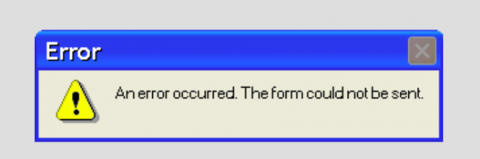
Source: Author’s screenshot
The message tells us nothing. So how to find a way out? Useless. Bad UX writing! Poor empathy can frustrate and irritate the user, which discourages them from using the product.
When working on error messages, I recommend considering these strategies:
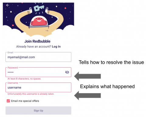
- Explain what happened. To the user, an error can mean a thousand things. To avoid making them frustrated or thinking they did something wrong, try explaining what happened. If there’s an internet connection error, say that a technical thing instead of blaming the user for failing to connect.
- Try to help resolve the issue. “So what do I do now?” – this is a typical response of users who got an error message. Try to help them find out the solution by offering some resolution paths.
Here’s an example. These error messages inside the RedBubble app follow these two strategies. The password error says it must have eight characters and no spaces. This way, the UX writer helps the user understand what went wrong and how to fix it. Next, the username error says that someone already has such a nickname. It tells us that a new one is needed.
Source: Author’s screenshot
By doing the same, you’ll also reduce user frustration and increase retention. Remember: empathy should be behind every message you write, be it a website, app, or another digital product.
Takeaway: Empathy is critical for every UX writer to avoid irritating, annoying, or frustrating the user. Try to explain everything and help users resolve problems to keep them engaged.
3. Final thoughts
So, here’s my guide to writing a great UX copy. Hopefully, my experience helped you to understand the challenges you might take on and mistakes to avoid.
To sum things up, a great microcopy:
- Talks about benefits for the user
- Uses the words the user understands well
- Addresses the user directly
- Is short and sweet
- Is written with empathy in mind.
Follow these tips, and you’ll avoid tons of iterations in your next project.