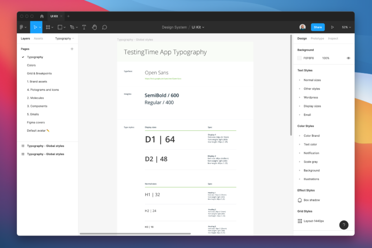
Table of contents
1. Design system creation process
2. Definition of tool
3. Conduct a design audit
4. Define basic design elements
5. Define design components
6. Define pages (screens, viewports, compositions)
7. How to share your design system
8. Recommended readings and examples
1. Design system creation process
According to respondents to the latest survey on the state of Design Systems in 2020, building a design system can land you in debt for two main reasons:
- Lack of planning
- Failure to understand the magnitude of a design system
So one important thing you need to know is that a design system is not a file that you complete once and assume it’s good forever. Creating a successful, long-lasting design system requires a great deal of effort and pre-planning.
The first step is to clearly plan who will be in charge of the design system and decide on the process they will carry out. You can do this in different ways: in solitary, centralised, or federated teams. You will also need to determine the business goals—how you will measure the success of the design system. This includes the cost and time required, the priorities, and the strategy to follow through on those priorities.
In our case, as we only have two designers on the product team, we’ve decided that only one person will be in charge and will dedicate a specific amount of time per week to maintaining the system. Also, when defining the OKRs for each quarter, we take into account that there must be a task related to the design system, either to update, add or remove certain elements. In this way, we ensure that a certain amount of time is always dedicated to keeping our design system in order.
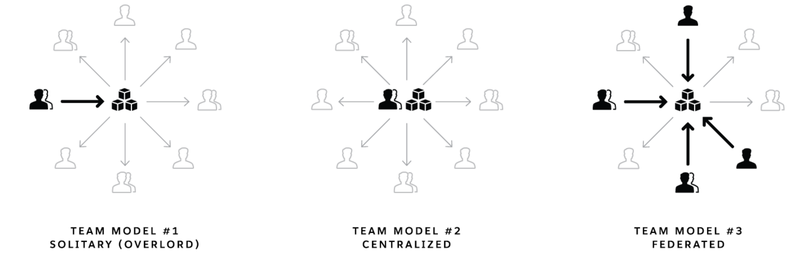
The three different approaches to organising a design system: solitary, centralised, or through federated teams (source: Medium.com).
2. Definition of tool
Before starting to prepare anything, it is important to define where you do the designs and where you do the documentation. It is essential to document best practices for elements, components, views, and patterns. Documentation can also include your guiding principles and code snippets, the rationale behind design choices, dos and don’ts, etc.
You can choose to do everything in Figma (i.e., create components, modules, etc. and the documentation of the whole design system) or do this separately with the UI Kit on a design platform such as Figma, Sketch, or Adobe XD while you do the design-system documentation on another platform.
Several platforms can handle documentation, and many of them are free. These are the four main types of documentation tools:
- Design tools – Use design tools to create any digital screen and manage all your digital assets. Also, use them to share designs (e.g., exporting images, online access and shared libraries). These tools, including Sketch, Figma, Adobe XD, and Framer X, aren’t designed for general documentation. Interestingly, Framer X mixes development and design by incorporating code.
- Documentation tools – These tools host publicly available web pages with version control that anybody can use to retrieve information. Most of these tools are geared toward developers, with options for hosting and displaying code. Because there is no integration with design tools, designers have to develop (and update) images of each design and manually (re)place them on the website. Examples include GitBook, VuePress, Fractal and Confluence.
- Design documentation tools – Frontify, zeroheight, Nuclino, Lucid, and Bynder are just a few examples of design documentation tools. Their layouts are better for displaying brand and design. Some of these tools even sync with your design tool automatically, so keeping your design system up to current with the latest modifications is a breeze.
In our case, we use zeroheight to explain use cases, combinations, values, etc. And then we have the UI kit in Figma. - Custom platforms – Finally, you have the option of developing your own platform. This gives you more leeway in what you can do. However, it requires far more effort and technical knowledge and does not support synchronization with your design tool (unless you are a very skilled programmer willing to create your own custom plugin). Google’s Material platform is an example of a custom-built platform.
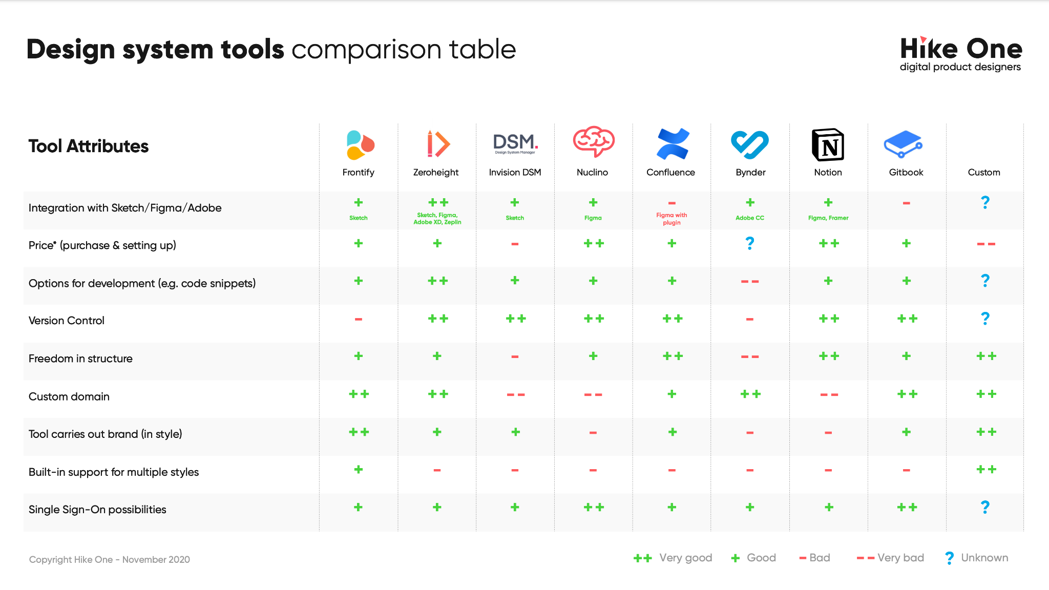
Comparison of different design system tools (source: Hike One).
As you can see, each tool has its own set of features, strengths, and shortcomings; thus, finding the right tool depends entirely on your requirements. So, what other questions should you be asking yourself? Do you use Sketch, Adobe XD, or Figma to create your designs? Are you collaborating closely with developers? Do you wish to incorporate marketing into your strategy? Or do you want to use a static or dynamic design system?
3. Conduct a design audit
Browse all the designs that have been made so far and take screenshots. Group them into different categories such as navigation, drop-downs, headers, etc. Then group those into subcategories, such as button states. Now look through what you already have and find patterns and inconsistencies. To sum up:
- Take screenshots of the components of your current product. Make sure you look at all the properties of your product like the help site, internal tools, different apps, etc.
- Use Figma or Google Slides to organise your screenshots or consider printing out each screenshot and pinning them on foam-core boards.
- Review each category to observe inconsistencies and note areas for improvement.
4. Define basic design elements
You must start your design system with the basics, which will be the tokens of your design system. Design elements are the basic building blocks of a user interface. The first step in creating a comprehensive design system is to define its base level elements. Try to get the lowest level of your component hierarchy. Later, you will use these basic elements to create your components.
Define a list of basic elements that you think your design system should have. You can find numerous checklists on the internet. Don’t worry if you see elements you haven’t defined yet or that you didn’t even know you had to define.
Every design system is unique. You don’t have to follow all the elements you see in the checklists. Just use them as inspiration for your complete design system.
In our case, we used the checklist you can download from this page, and we’re still using all the elements on the list.
Depending on what you discover in your research, you decide what to tackle next. If you lack consistency in structure, colours, patterns, icons, etc., you can define your basic elements to ensure more consistency. Here are some examples:
4.1 Grid
You’ll need to establish which layouts you use most and then apply changes to the ones you already have. For example, if the company is not used to working with grids, the elements may have been designed with proportions that will never look the same in development because you used the wrong grid.
So you’ll need to find out which viewports your users use most and base your designs on that information. Then, you will have to define what kind of grid you use depending on the viewport. This is something you can define with the developers. There is no one right solution.
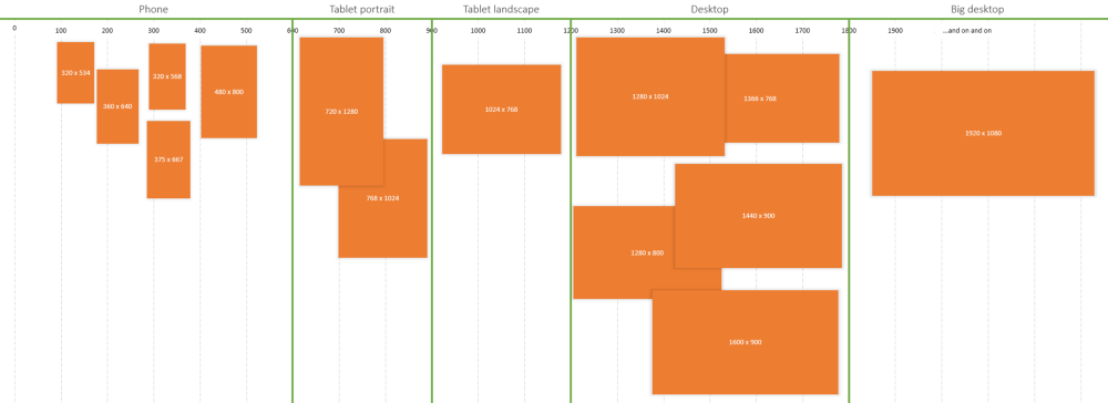
The 100% correct way to do CSS breakpoints (source: Udar Updates).
4.2 Colours
Another basic element: the brand colours. It might seem silly, but many companies end up using different versions of the same colour simply by not setting it and not sharing it with the rest of the team. So it is crucial to establish the brand colours: the primary, the secondary, the neutral tones, the extra colours for illustrations, etc.
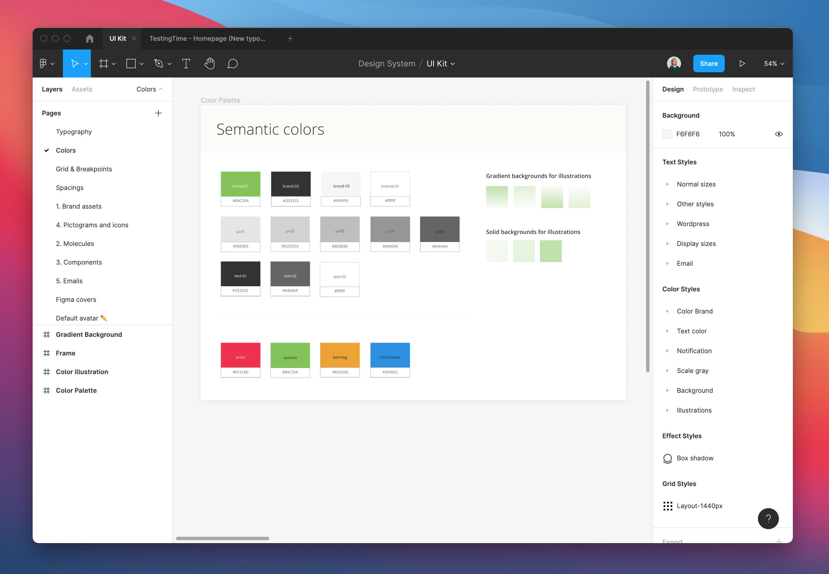
Our brand colours (source: TestingTime’s design system).
4.3 Spaces
Another important basic element to define is the spaces. If we don’t establish the spaces that we’re going to use, our product will have an infinite number of different spaces with no logic between them. So, if we define the spaces, our designs will be more consistent.
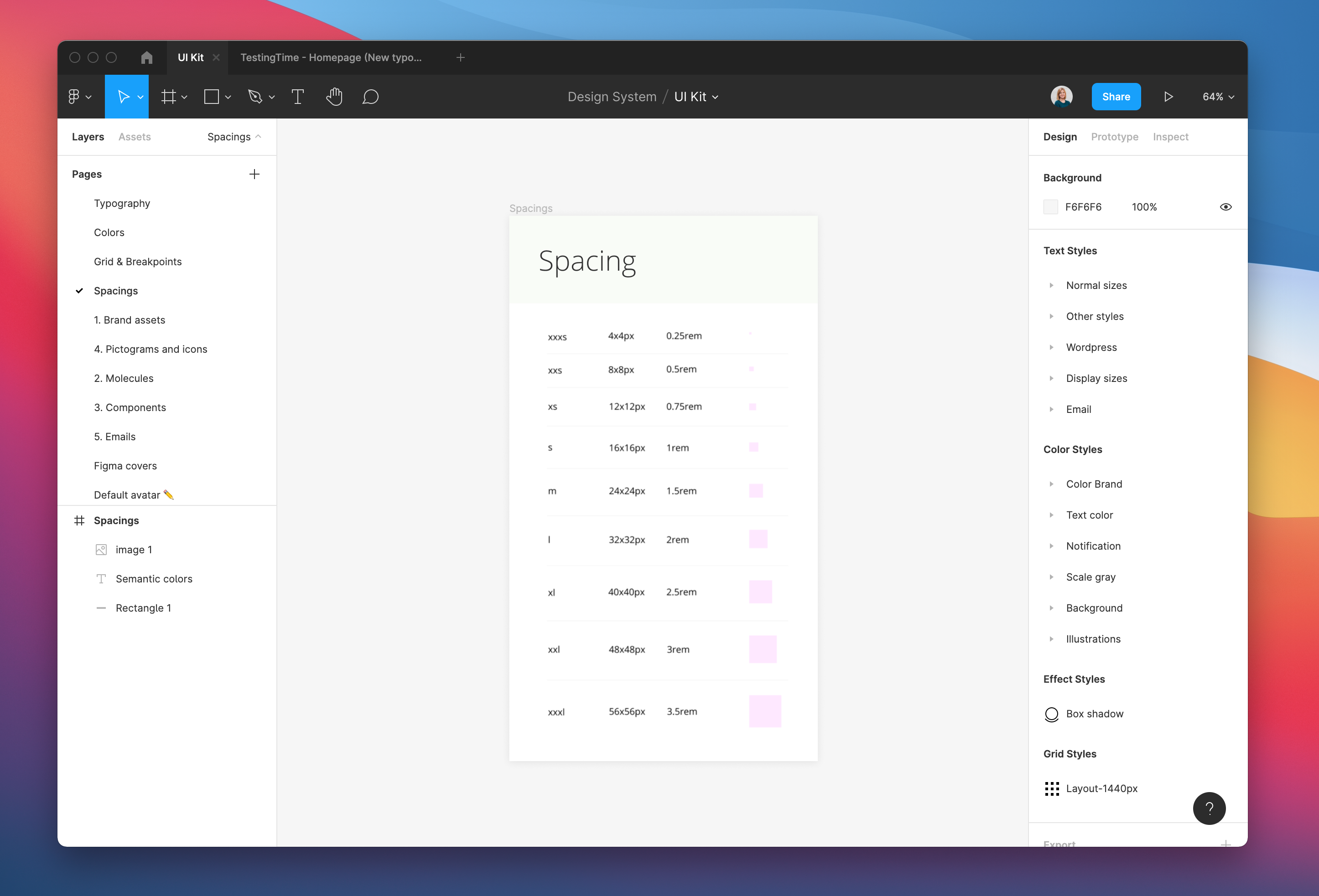
Our spacing rules (source: TestingTime’s design system).
5. Define design components
Components are functional pieces of a user interface created from the basic tokens that come together in various ways to form a composition. You will also need to define the different states of the components, how they look when hovering, focused, active, etc.
Creating components is one of the most time-consuming tasks when creating the design system. In the beginning, it’s simple because you only have to replicate the components you already have and define when and how to use them. The complicated part is creating a new component and adding it to the design system. At this stage, you need to check whether or not the component you want to develop is promising. You always have to do this when you need to add a new component, so don’t be discouraged. It takes time and a lot of patience to improve the usability of a product!
However, once you have the new component, you simply add it to your design system and define when and how to use it. The better you can explain the component, the fewer questions you have to solve later. So if you have animations that show the operation, it’s even better. In the next phase, the design is aligned internally and passed to the development team. Don’t forget, your design system is itself a product, and you need to communicate whenever you update it or add anything new.
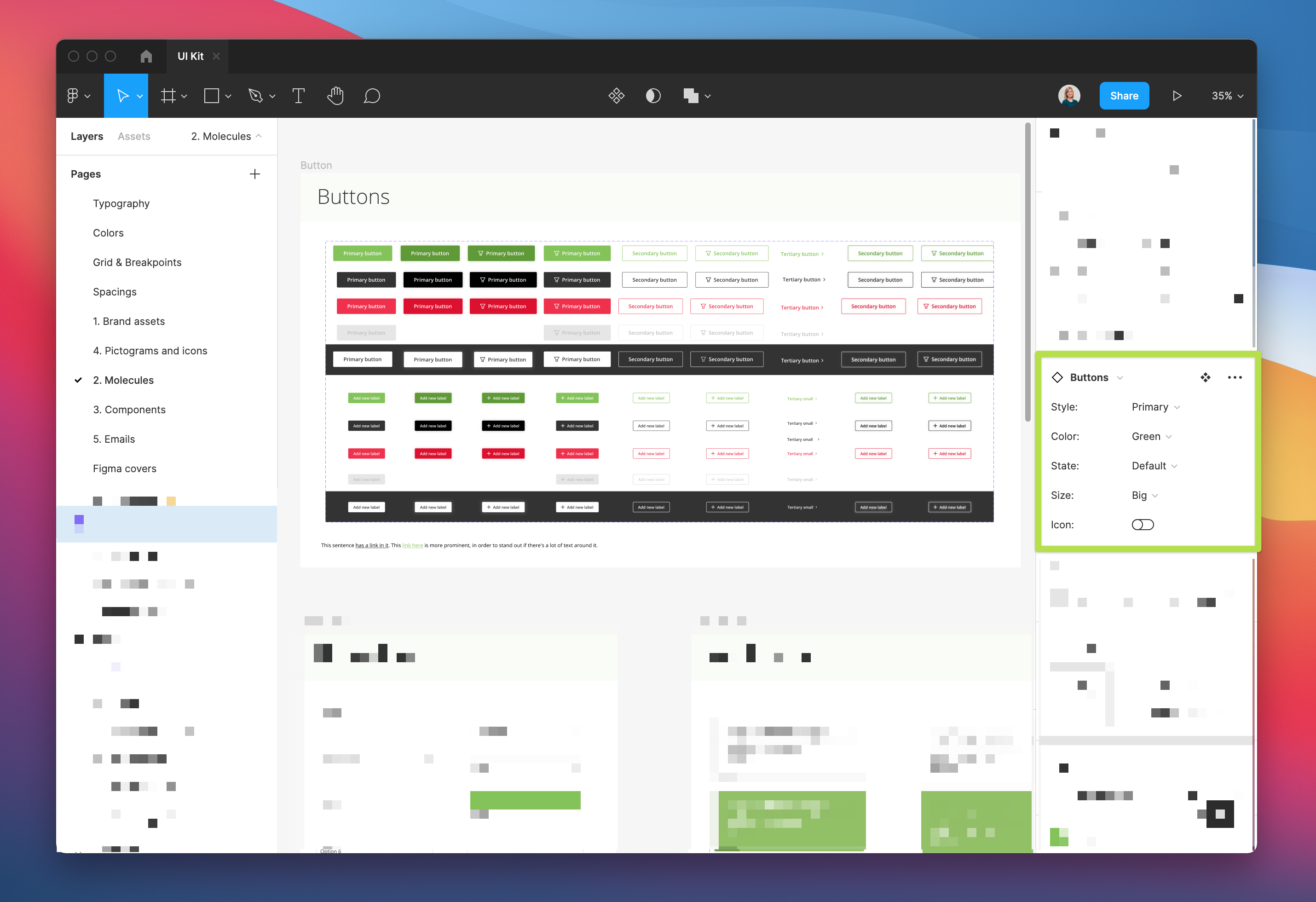
How we provide the different button combinations in Figma (source: TestingTime’s design system).
It may seem a bit messy, but the important thing is that everything is well connected in the UI kit and that—when it comes to design—the designers can clearly see what combinations they have. Then, apart from having it in the UI kit in Figma, we also have zeroheight, where we explain the different use cases, right and wrong combinations, etc.
6. Define pages (screens, viewports, compositions)
Once you’ve defined the components of your product, you can combine them to create pages. This process shouldn’t take too long since once you have all the components designed. What can take more time is defining when to use each type of page, explaining the rationale of each page, whether or not you did research, the results of the research, etc.
In our case, we did the redesign of our website, for which we did a whole research process, and it was documented so that in the future, we’ll still be able to understand why we made the decisions we did.
Once you’ve done the research, the next step is to pass it to our UI kit as different components and their variants so that in the future they can easily be reused as single elements to create new components or edited in a future design.
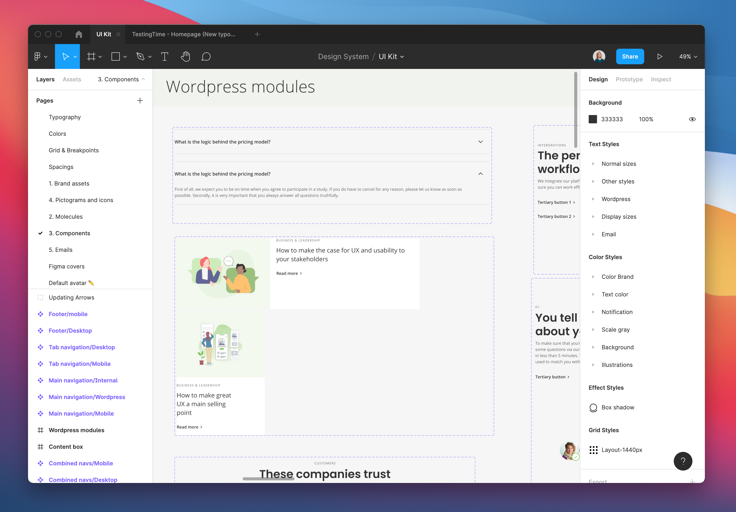
The designs of our WordPress modules for the website (source: TestingTime’s design system).
7. How to share your design system
Everyone in the company should have access to the design system. And the best way to ensure that everyone is up to date with the latest version is to have a single source of truth on a website, for example. I can assure you that using a PDF or a Google Doc won’t work: everyone will lose it, use the wrong version or simply not use it at all.
A small company could use an internal wiki site if maintaining an external site involves more work. It is also essential that the product team doesn’t depend on the developers to keep the design system up to date. Inevitably, people forget to use it or can’t find it. That’s ok—just keep reminding them until it becomes a habit. Whenever you have updated or added a new token, component or page, share it with your teammates and remind them where they can find it and, if necessary, organise a workshop to explain, among other things, the structure and the content you can find.
8. Recommended readings and examples
I have put together some interesting readings that can help you build a design system. If you want to be up to date with the state of design systems in the sector, I recommend you read this study.
An excellent example of a design system is Airbnb, so if you want to know more about how they implemented their system, I recommend this article.
One book that has most helped to understand what a design system is is Atomic Design. So reading Atomic Design is crucial to a better understanding of design-system ecosystems.
To find out more about the history of the design system, I recommend this article.
Explore the exemplary design systems of the following organisations:
- Google: material.io/design
- Salesforce: lightningdesignsystem.com
- IBM: ibm.com/design/language
- Shopify: polaris.shopify.com